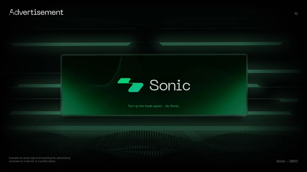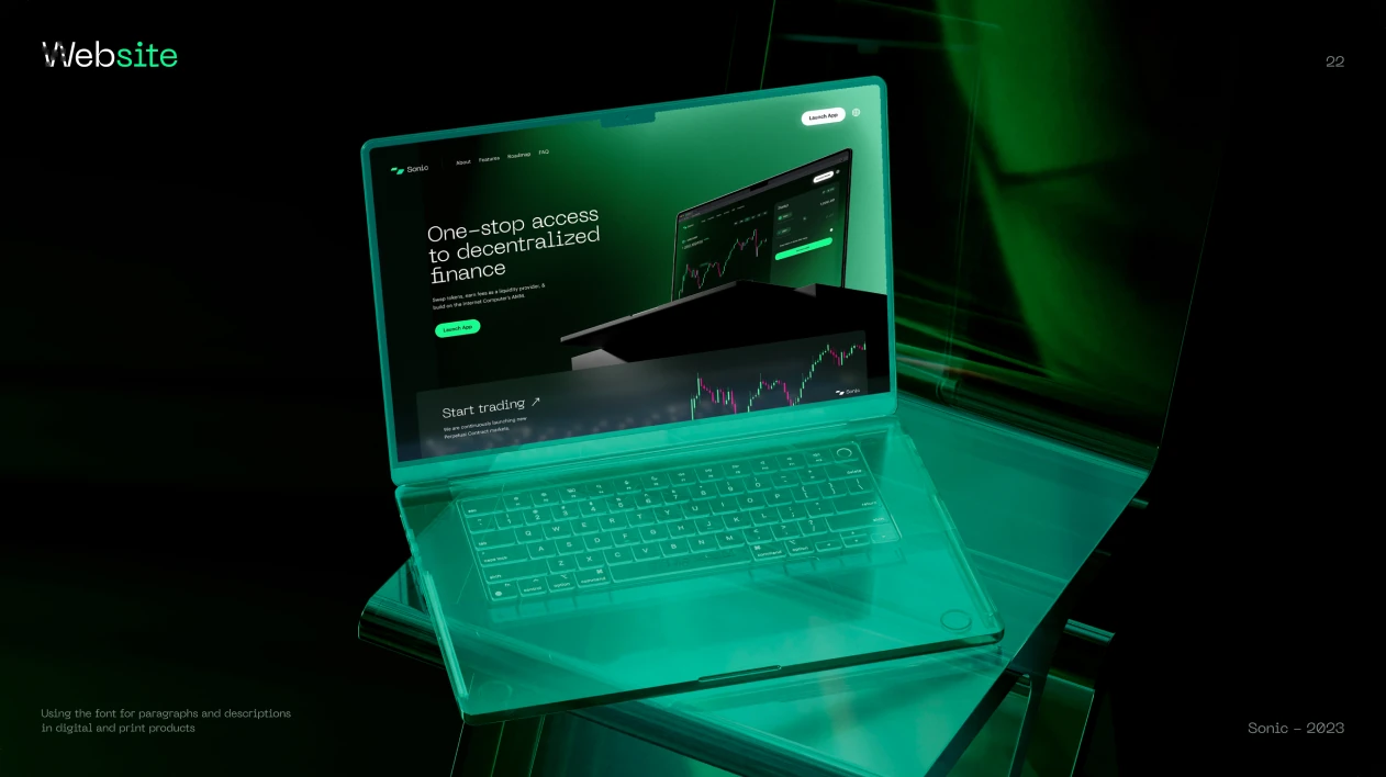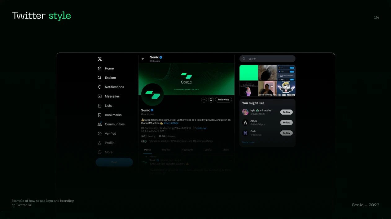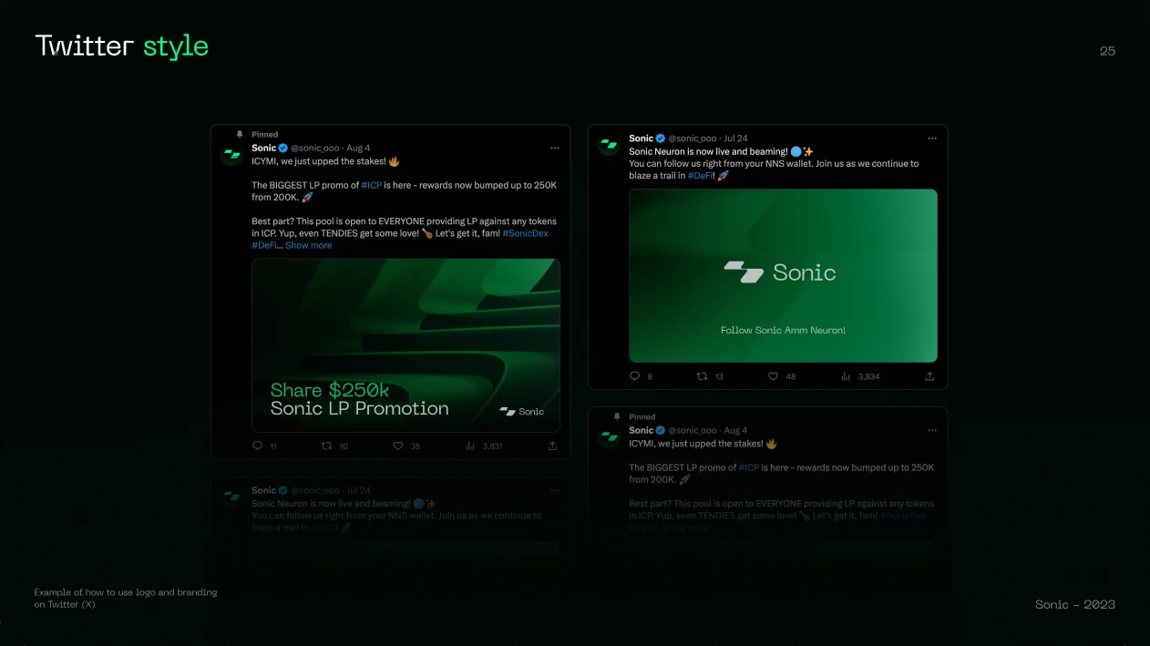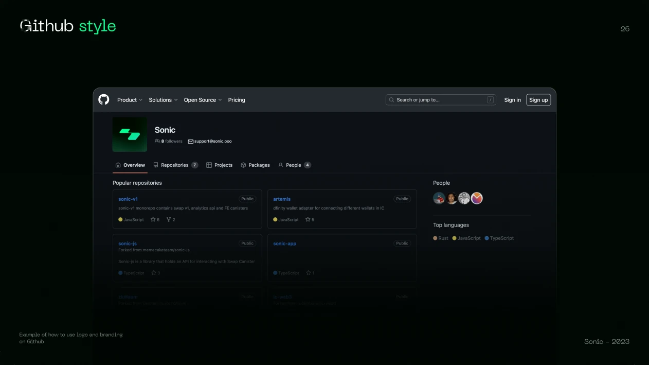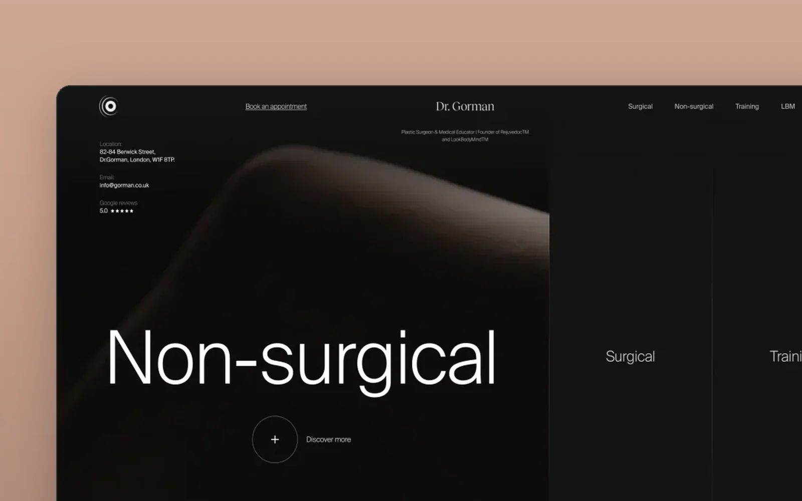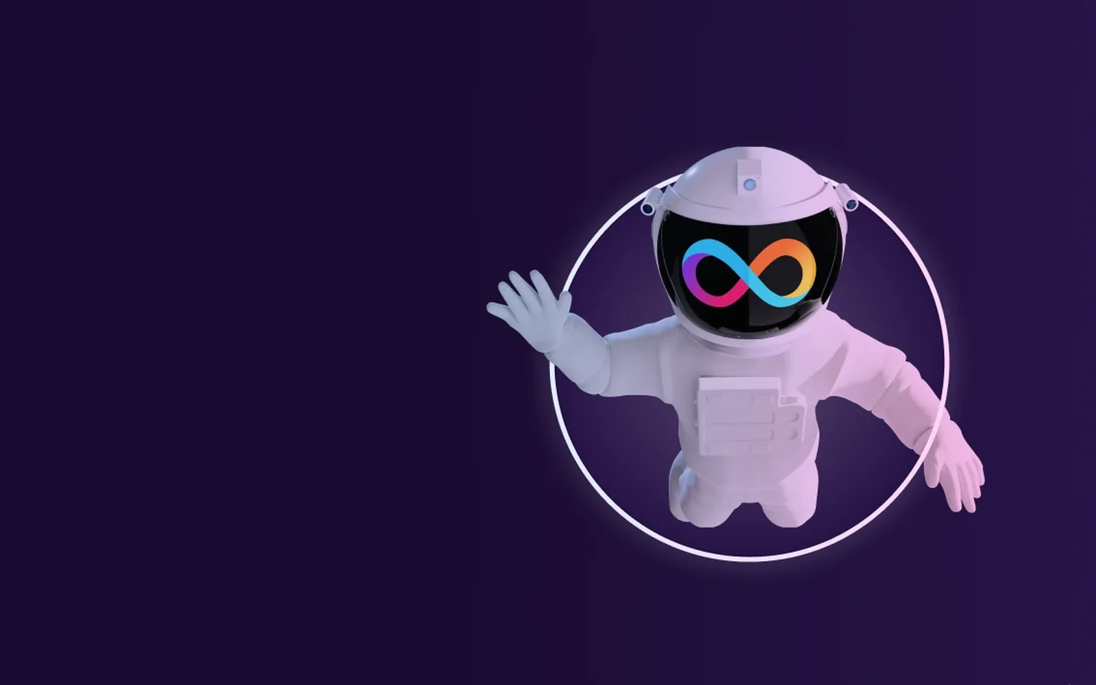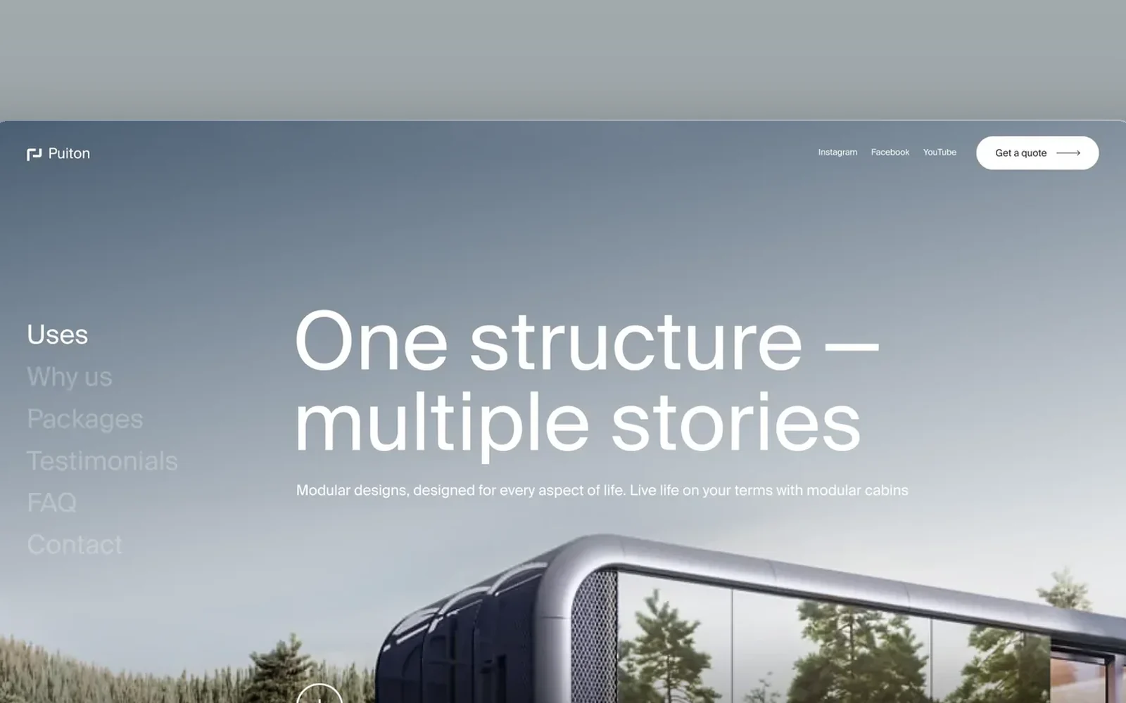
Sonic identity in motion.
Selected brand frames and the published logo animation from the Sonic Web3 identity case. Created with Nikita Loginov and Dmytro Dintsen.
A market story built from the interface.
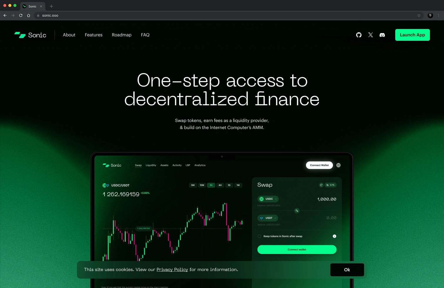
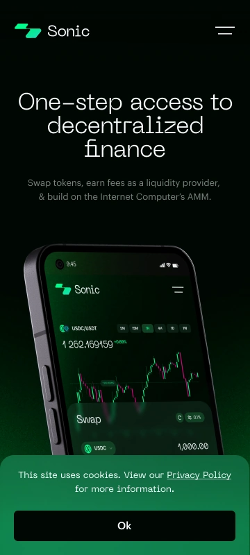
Market activity, product benefits and the community model share the same visual language. The full homepage is shown in desktop, tablet and mobile layouts.



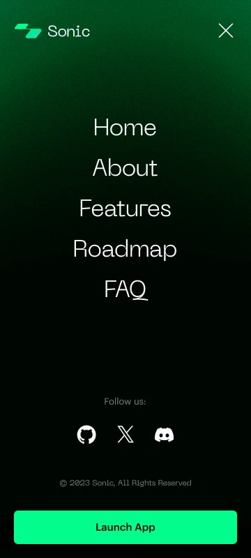
Navigation and preferences.
A cookie notice and the phone navigation menu.
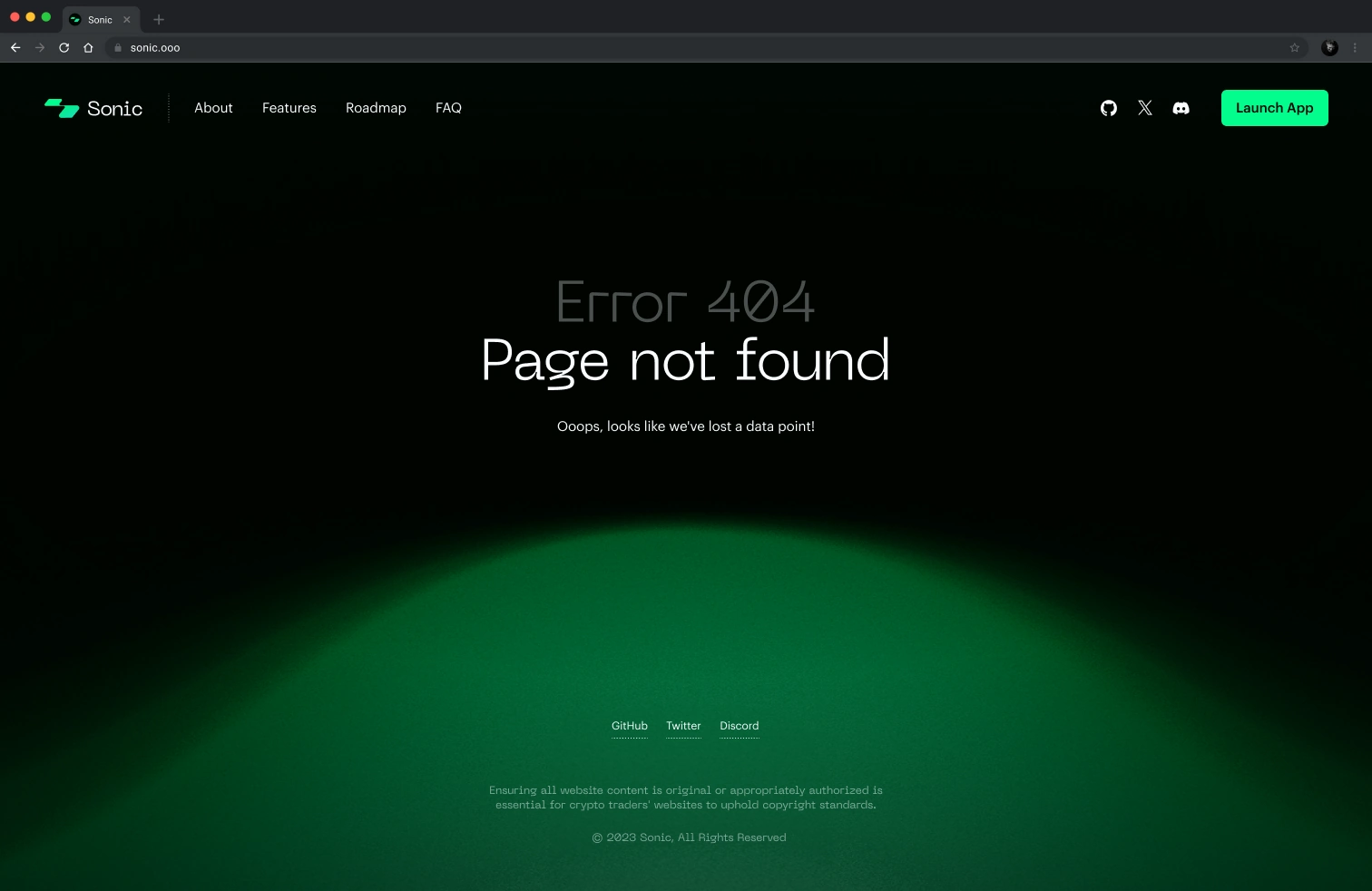
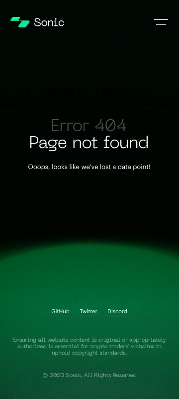
When a page is missing.
The 404 screen keeps the same recovery state on desktop and mobile.
Before the content arrives.
Loading screens retain the product identity at each viewport.
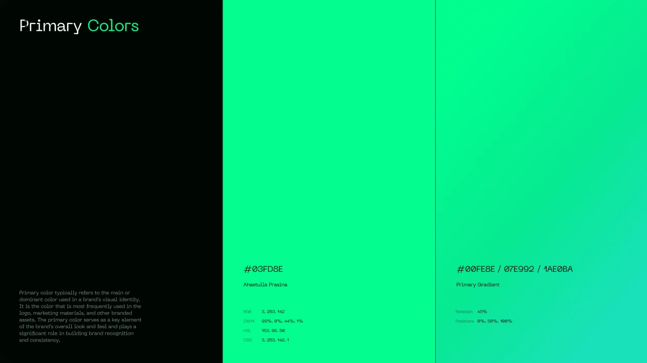
One visual language.
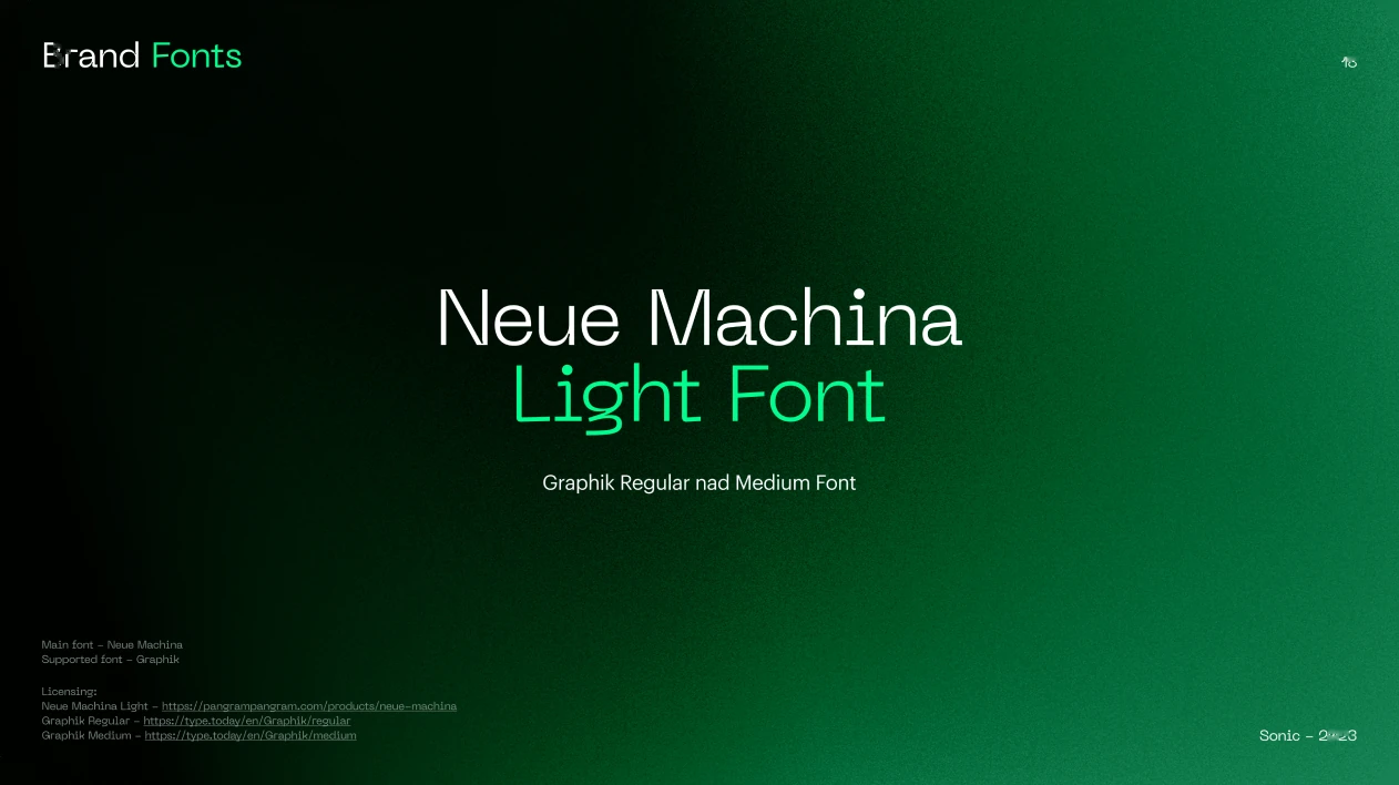
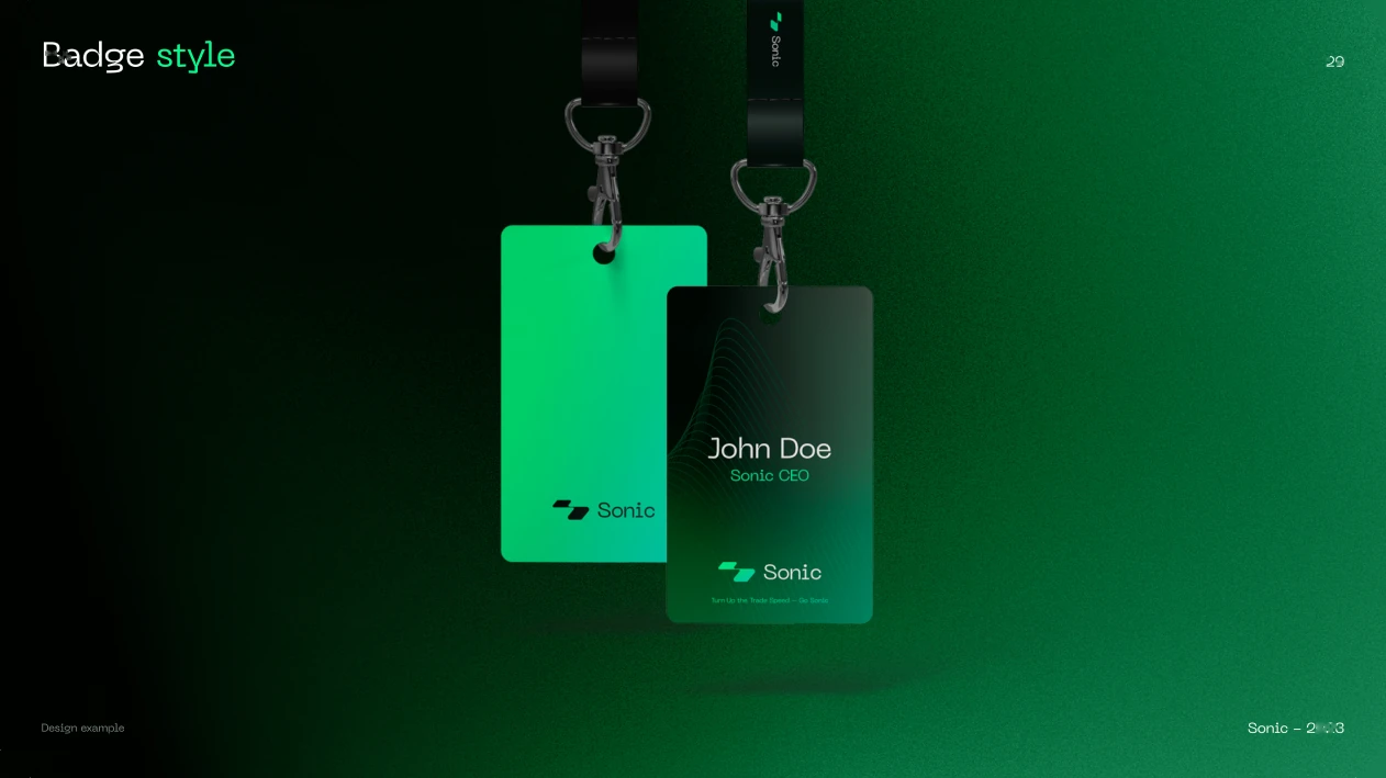
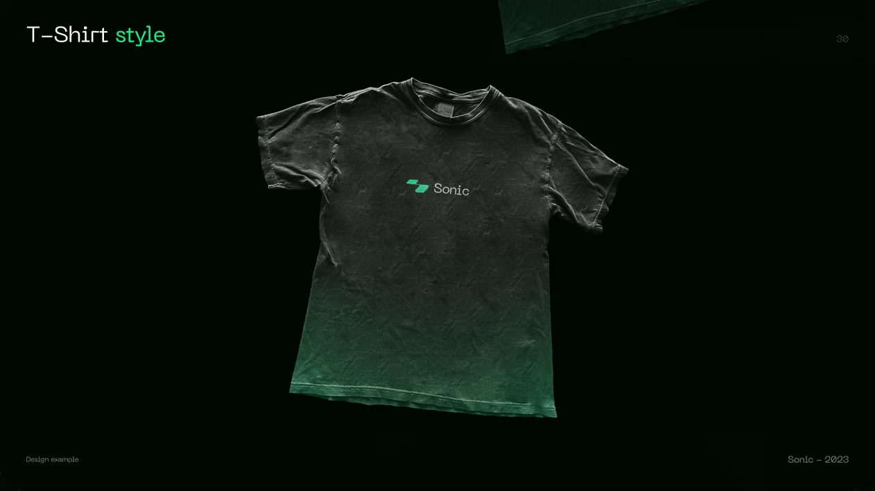
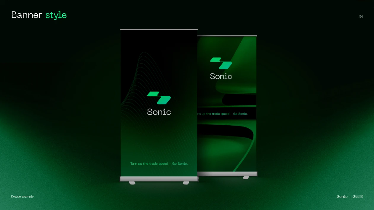
Colour, type and brand applications connect the product and its identity.
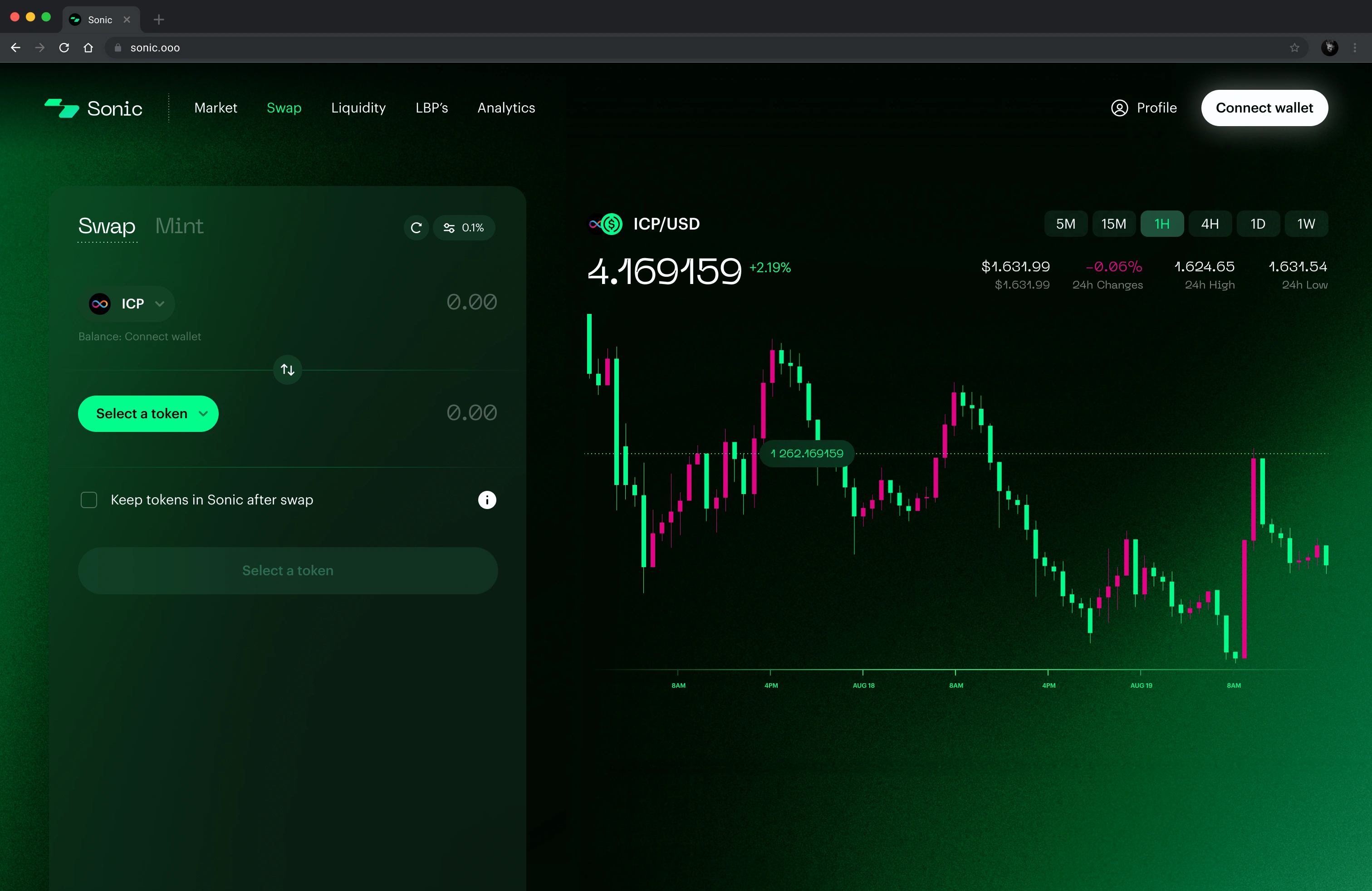
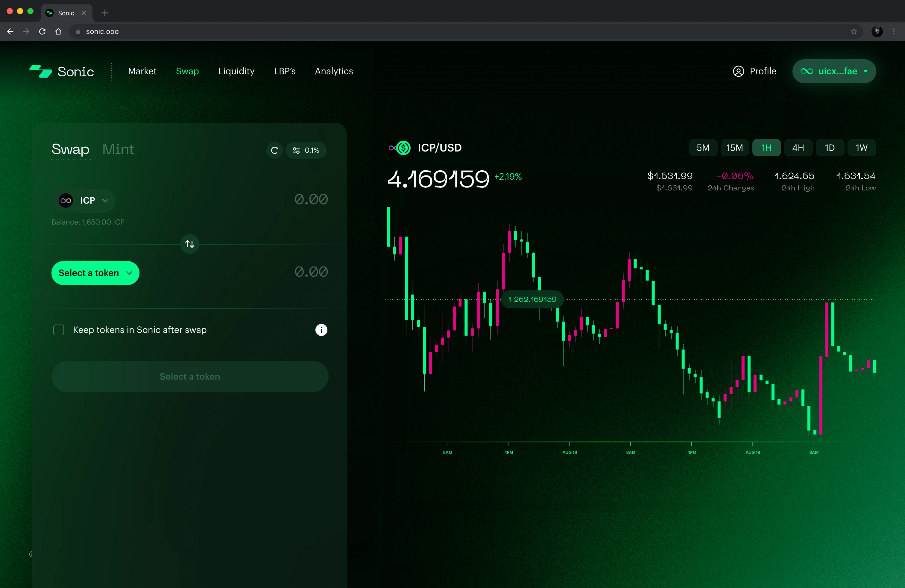
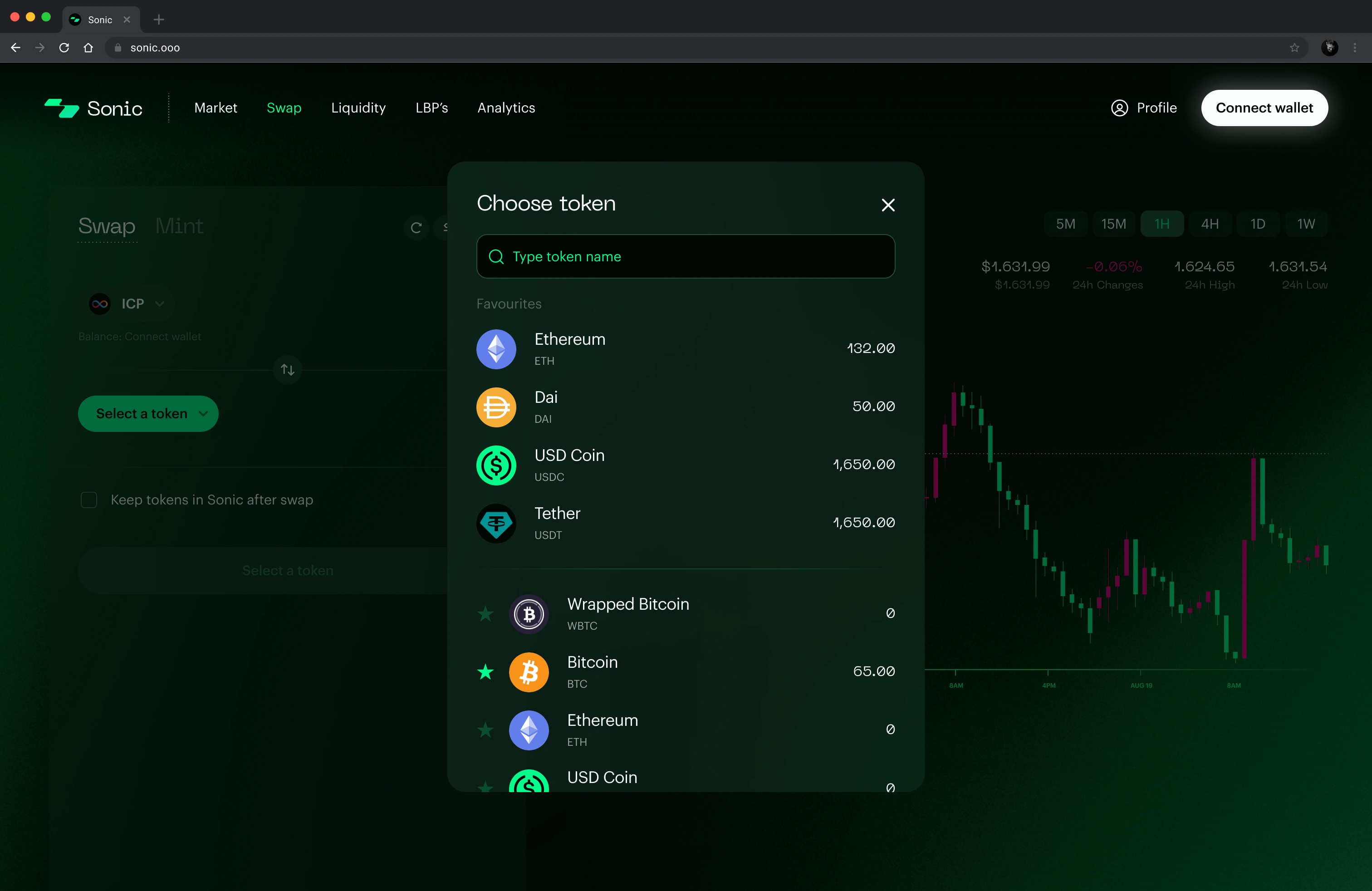
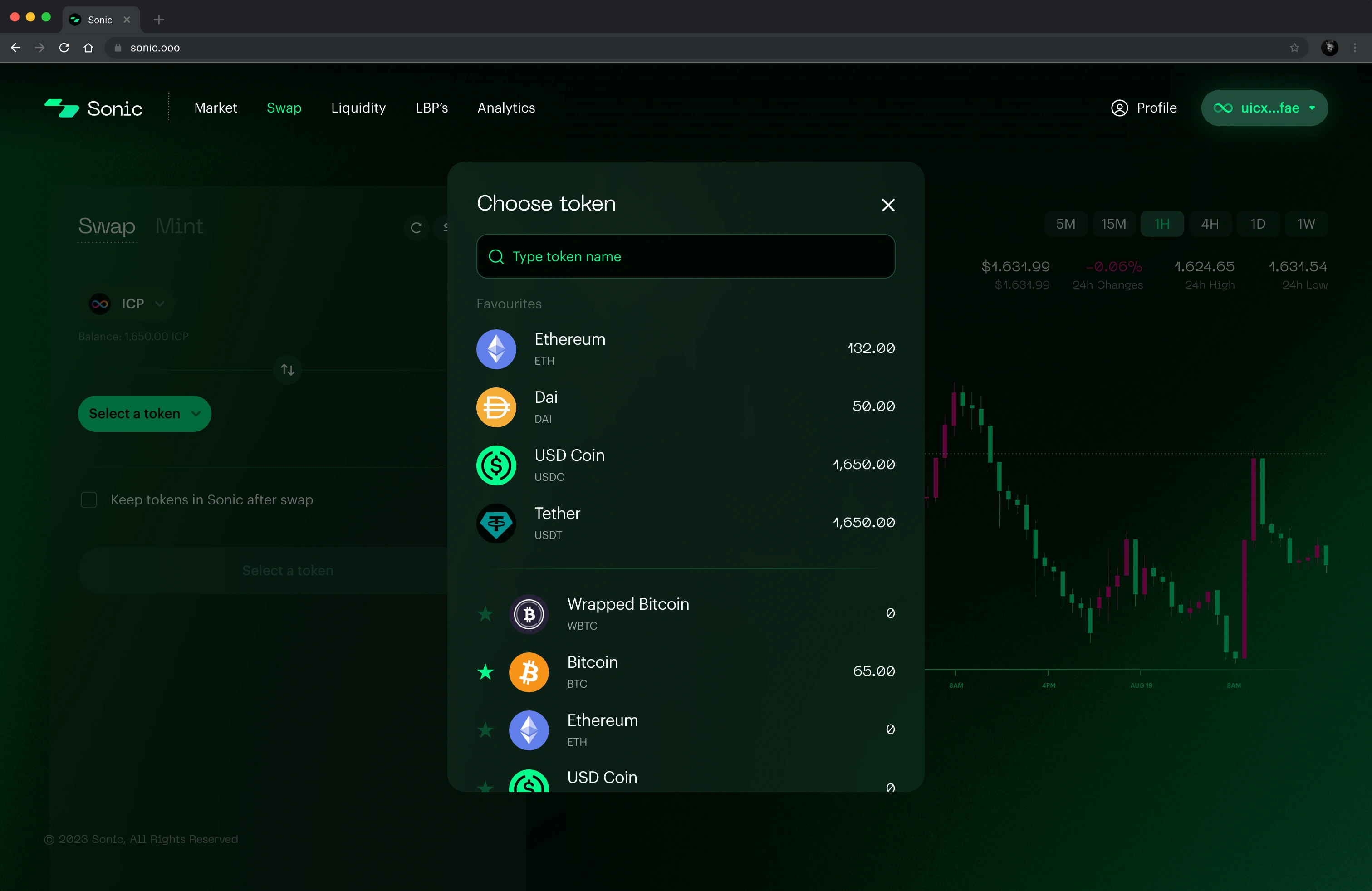
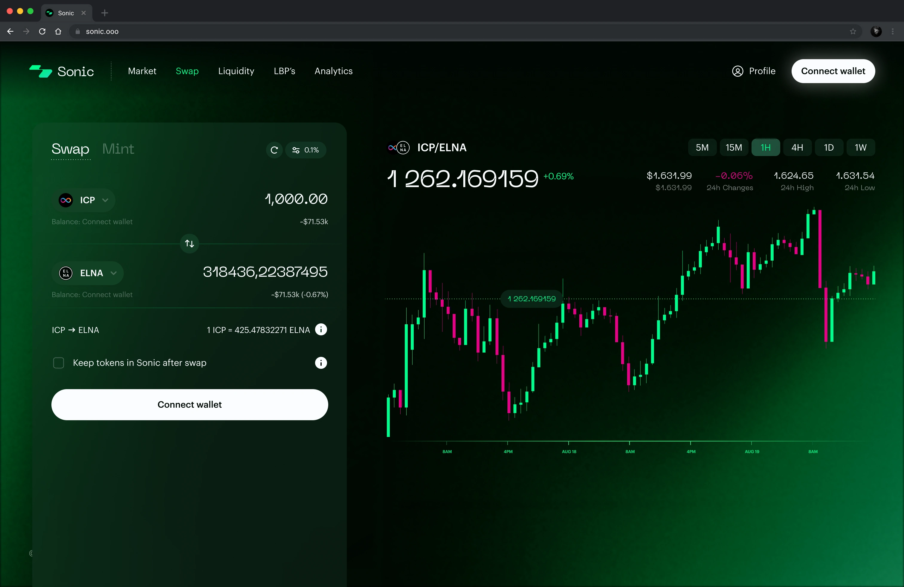
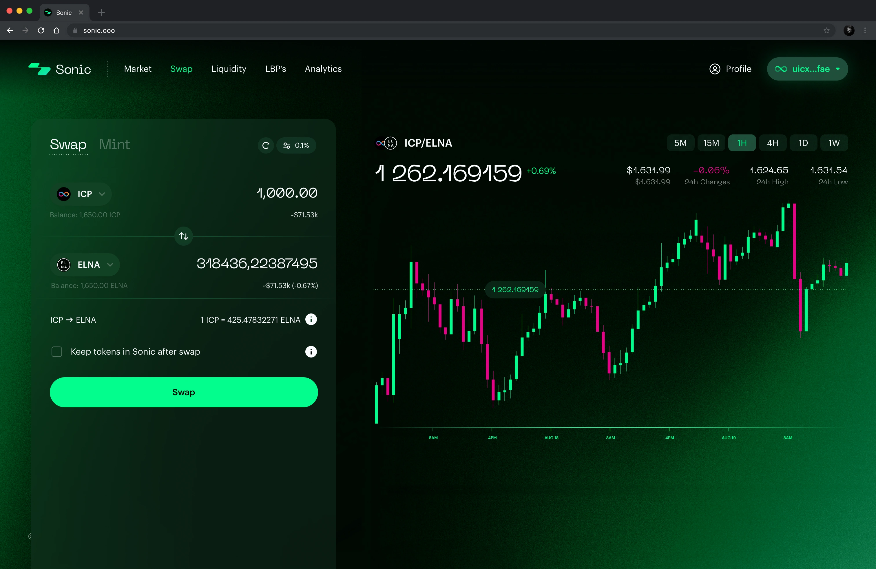
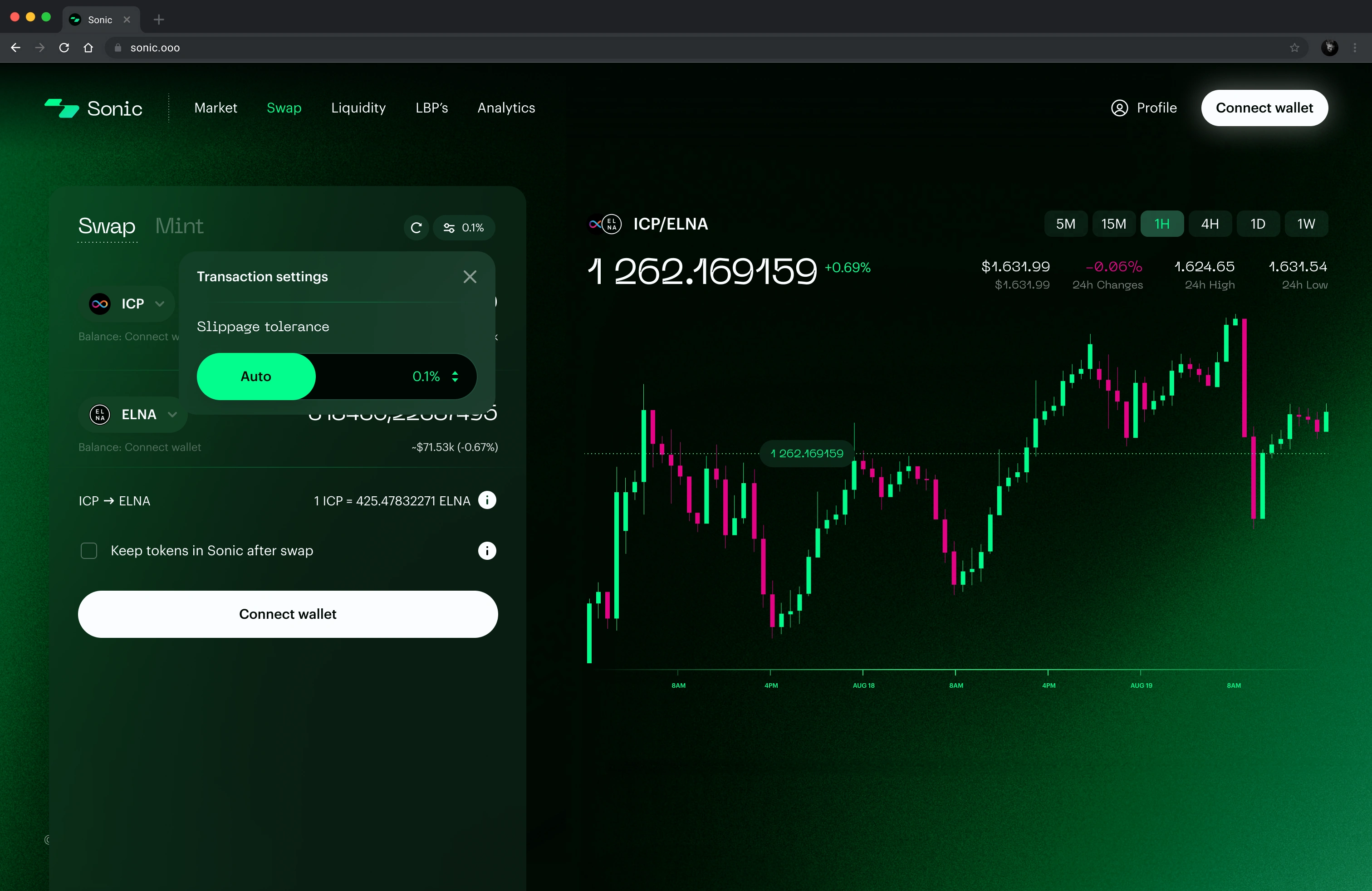
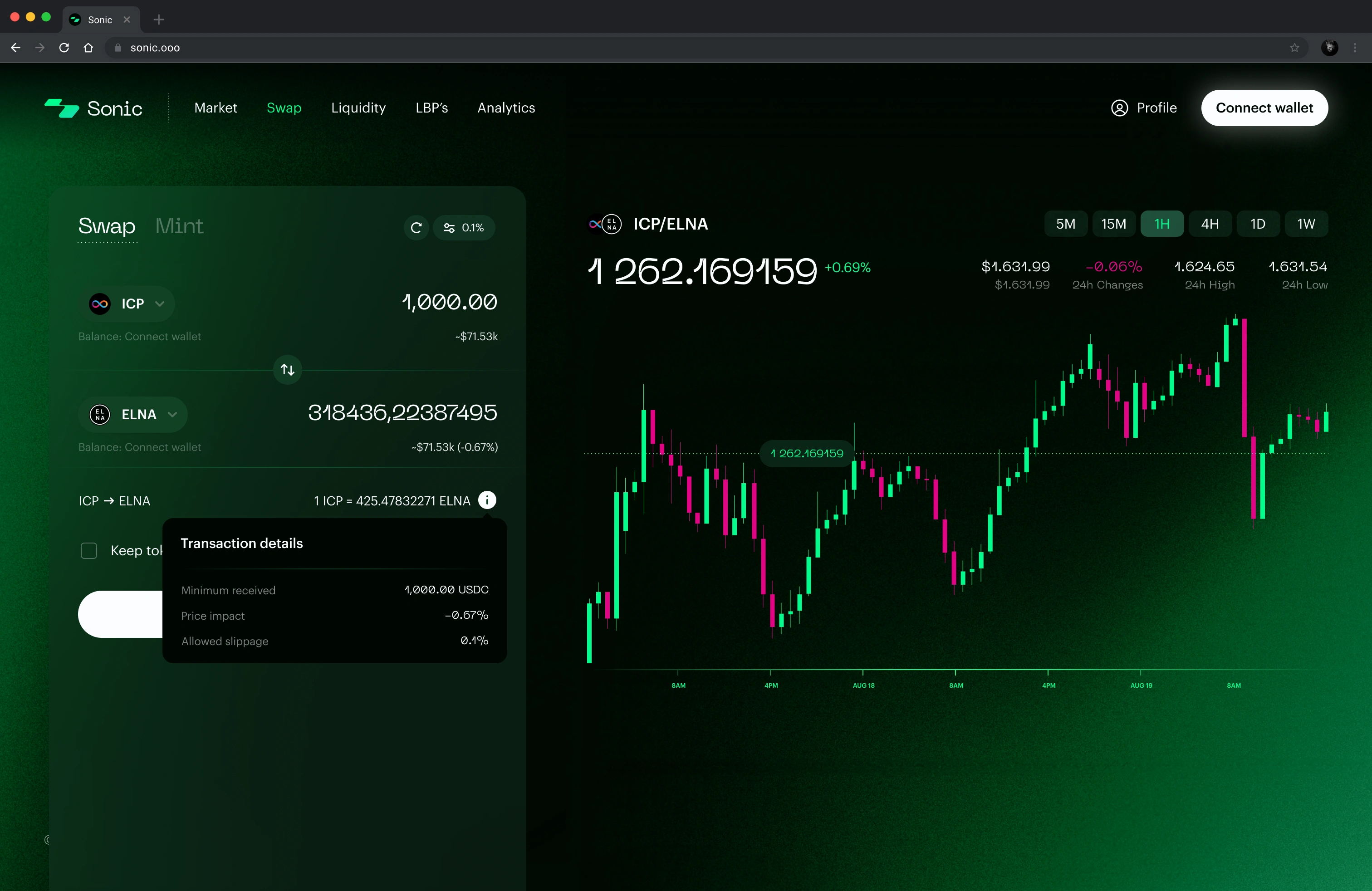
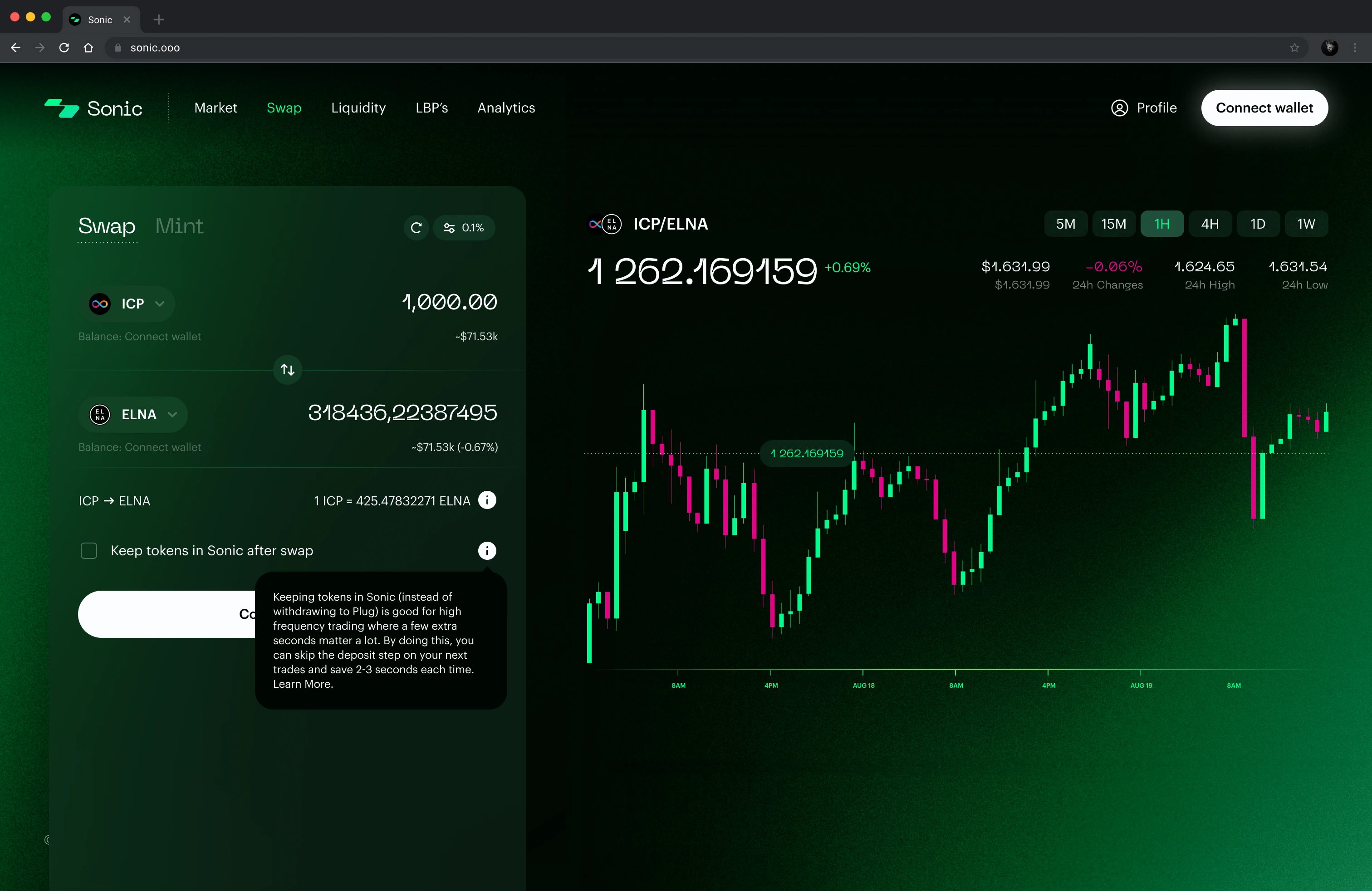
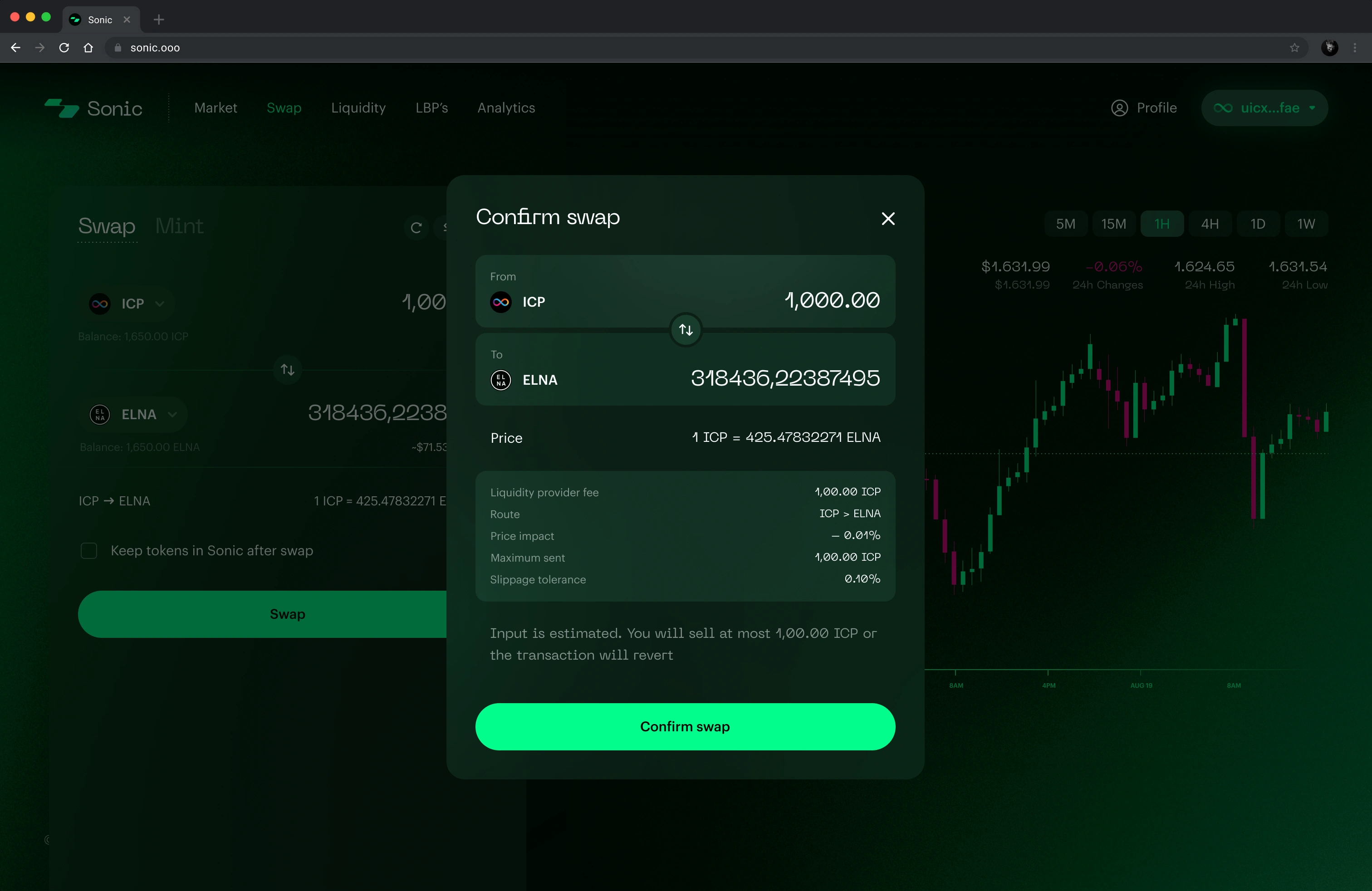
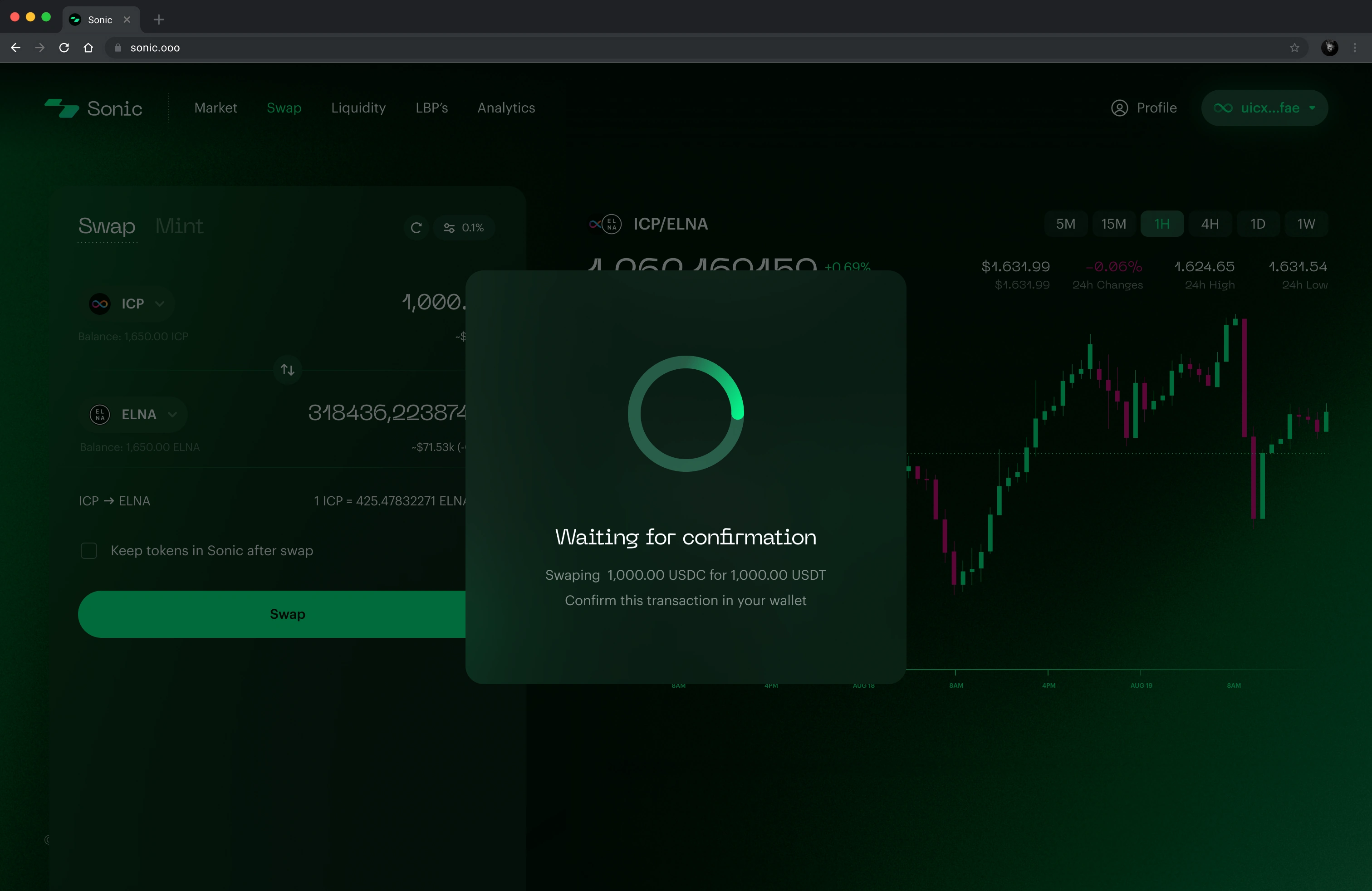
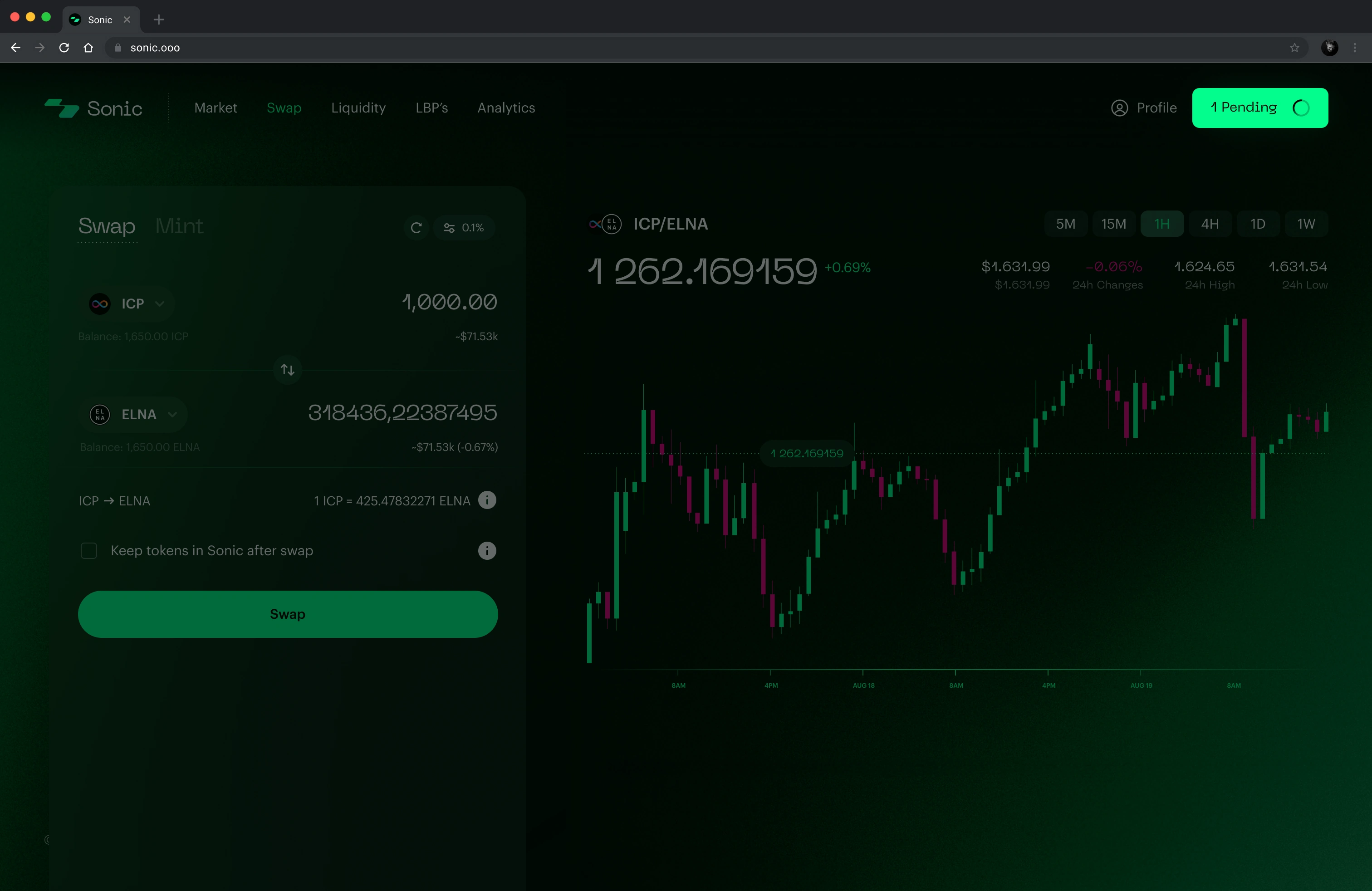
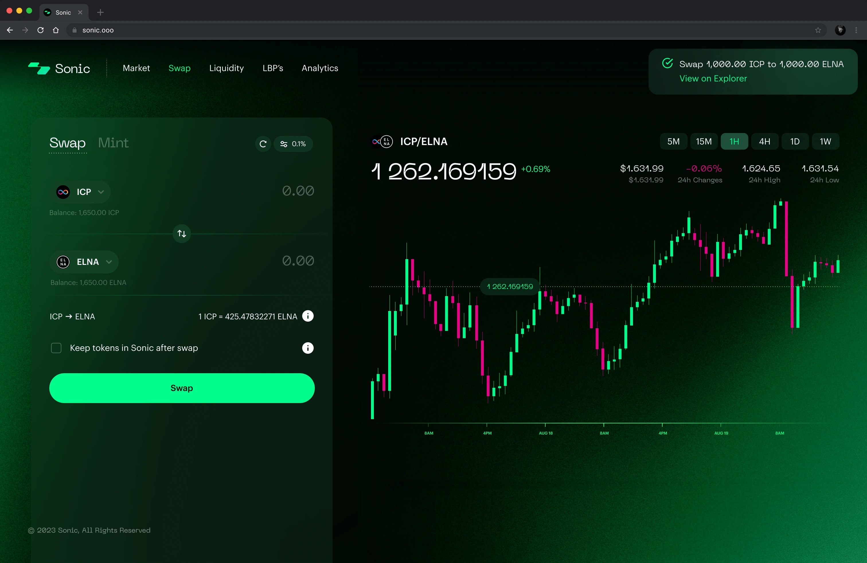
Every step of the swap.
Connection, token selection, transaction details and slippage precede confirmation. Waiting, pending and completed states make the transaction status visible.
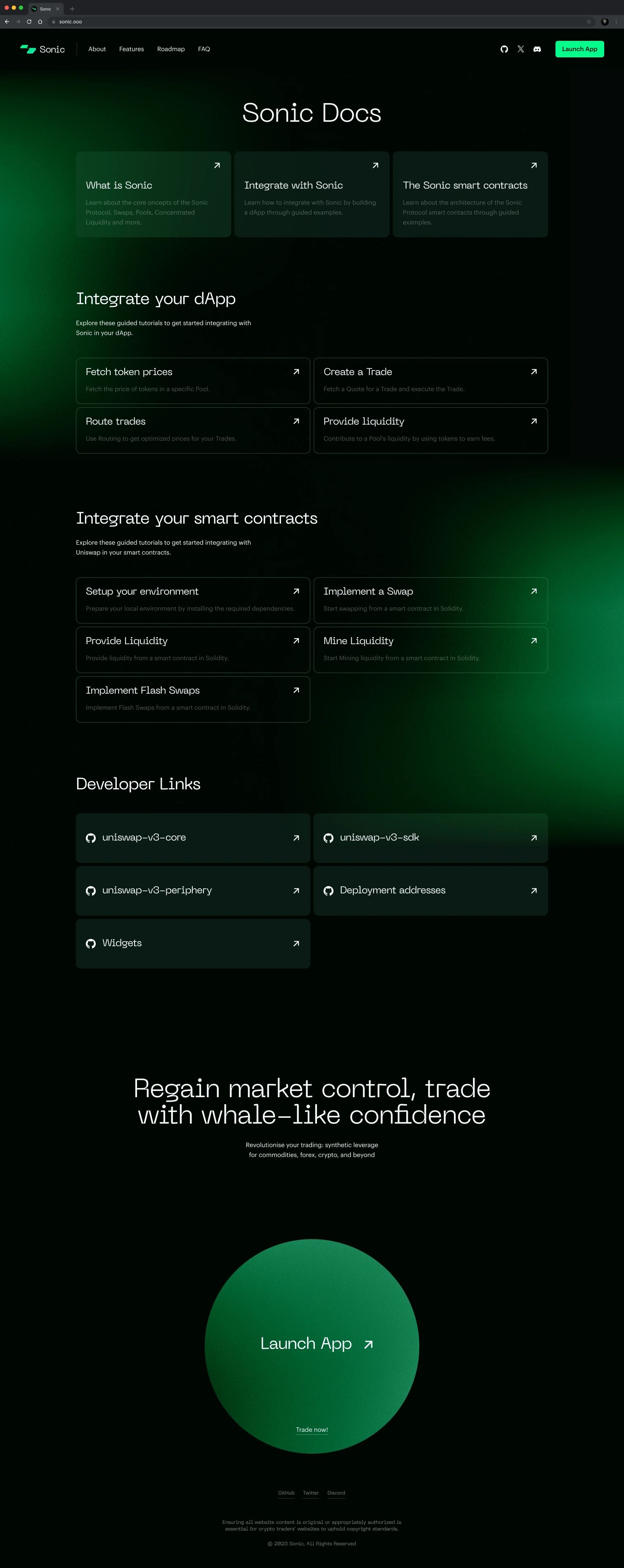
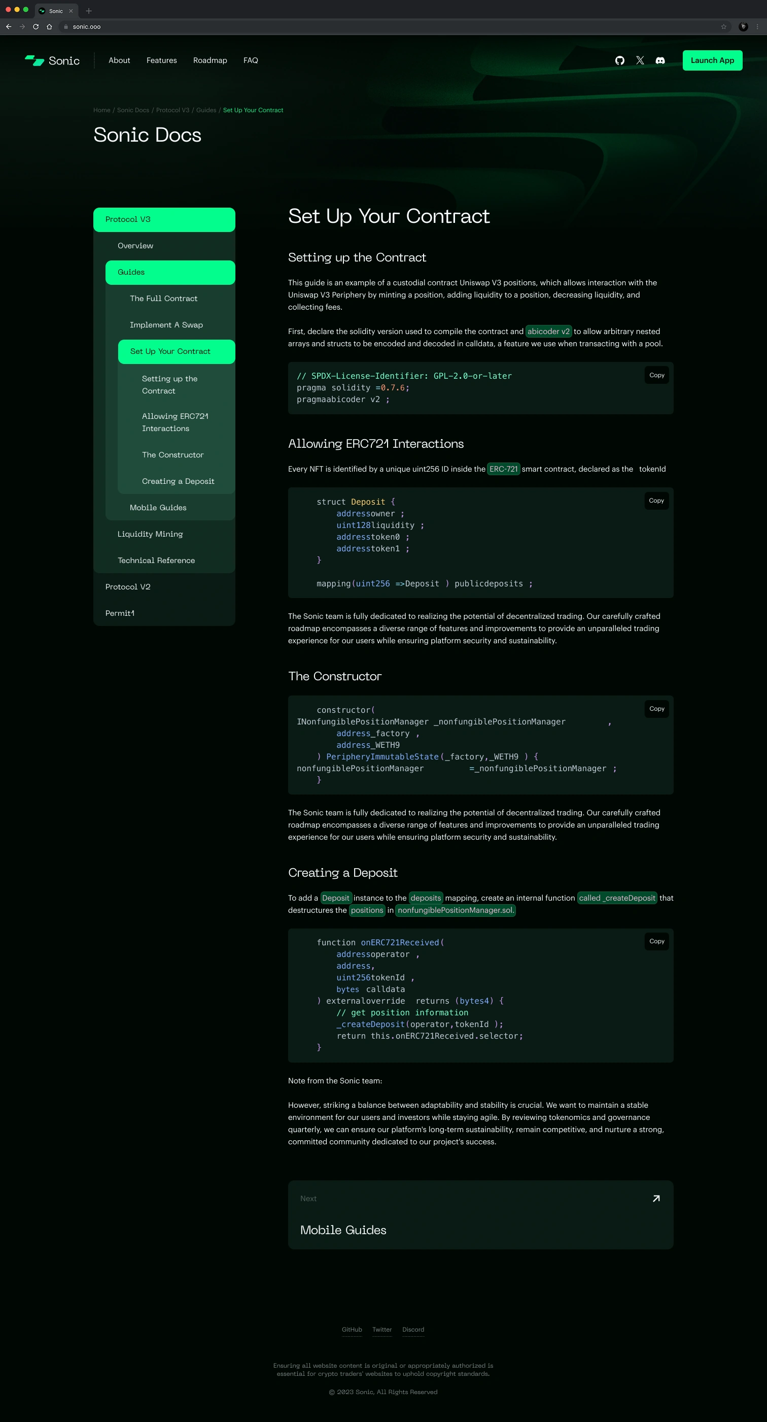
A place to build.
Developer documentation and its example page, on desktop and on a phone.


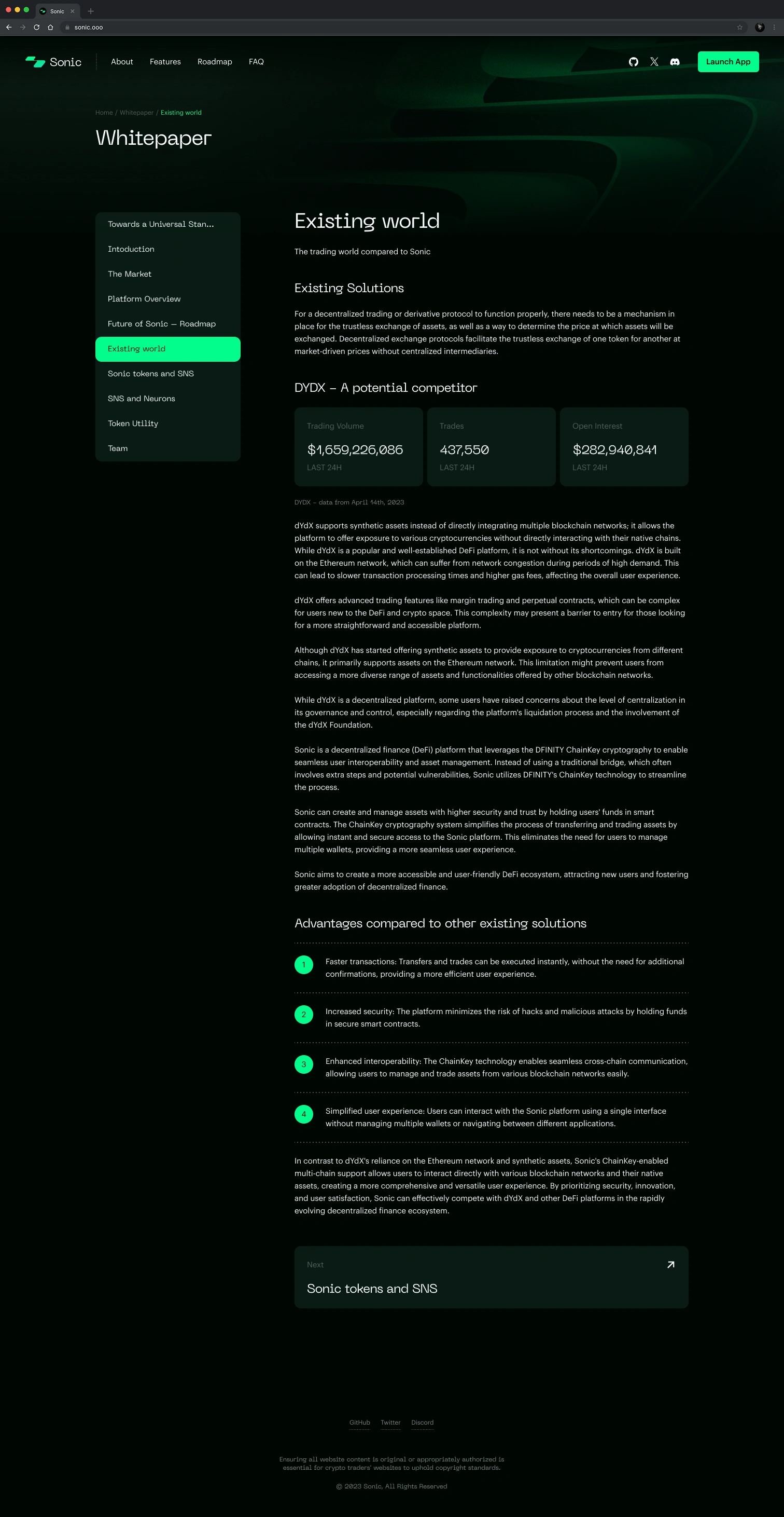
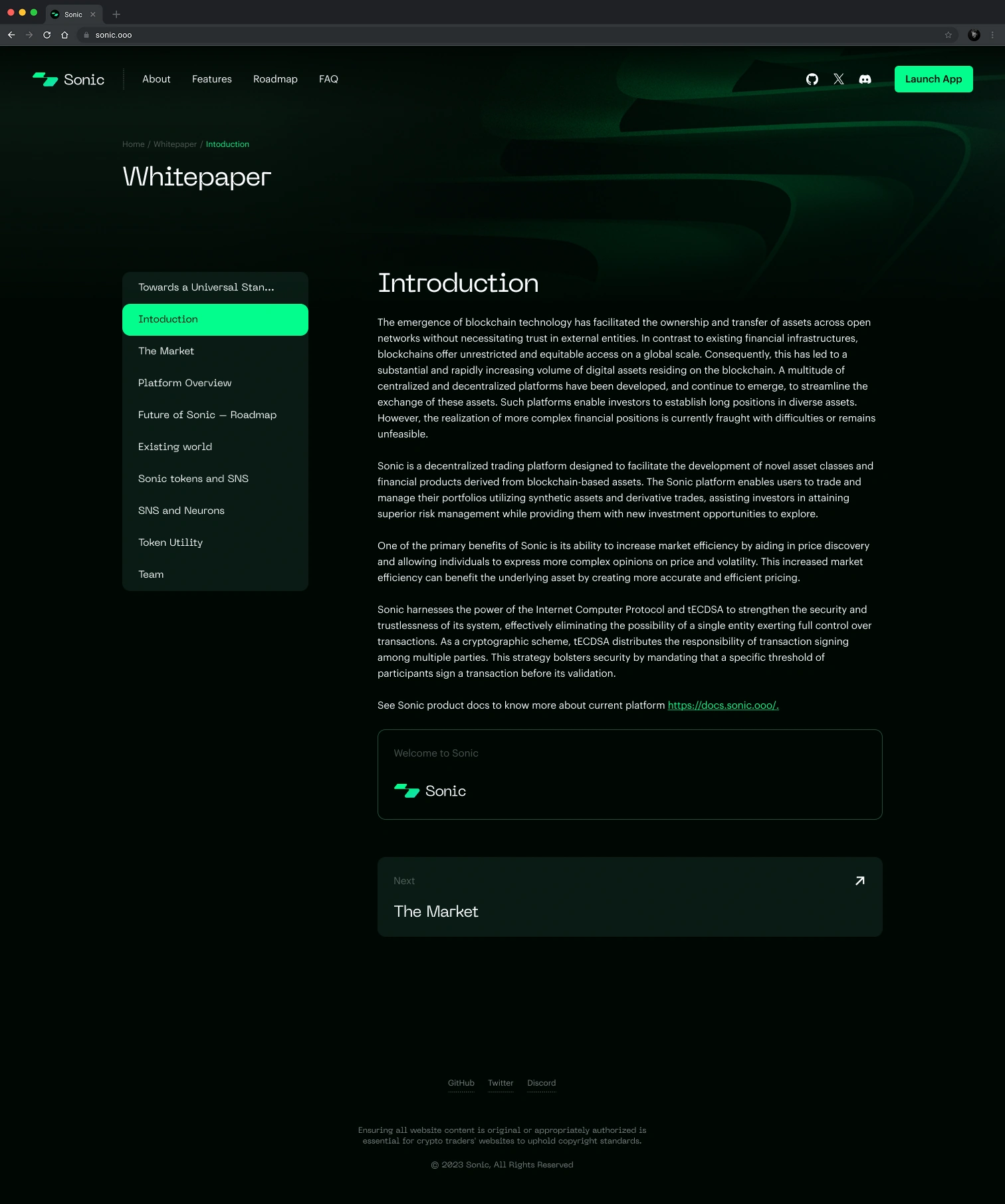
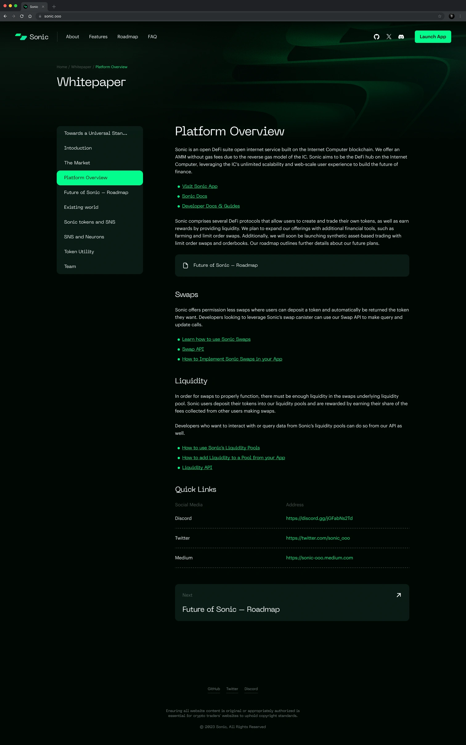
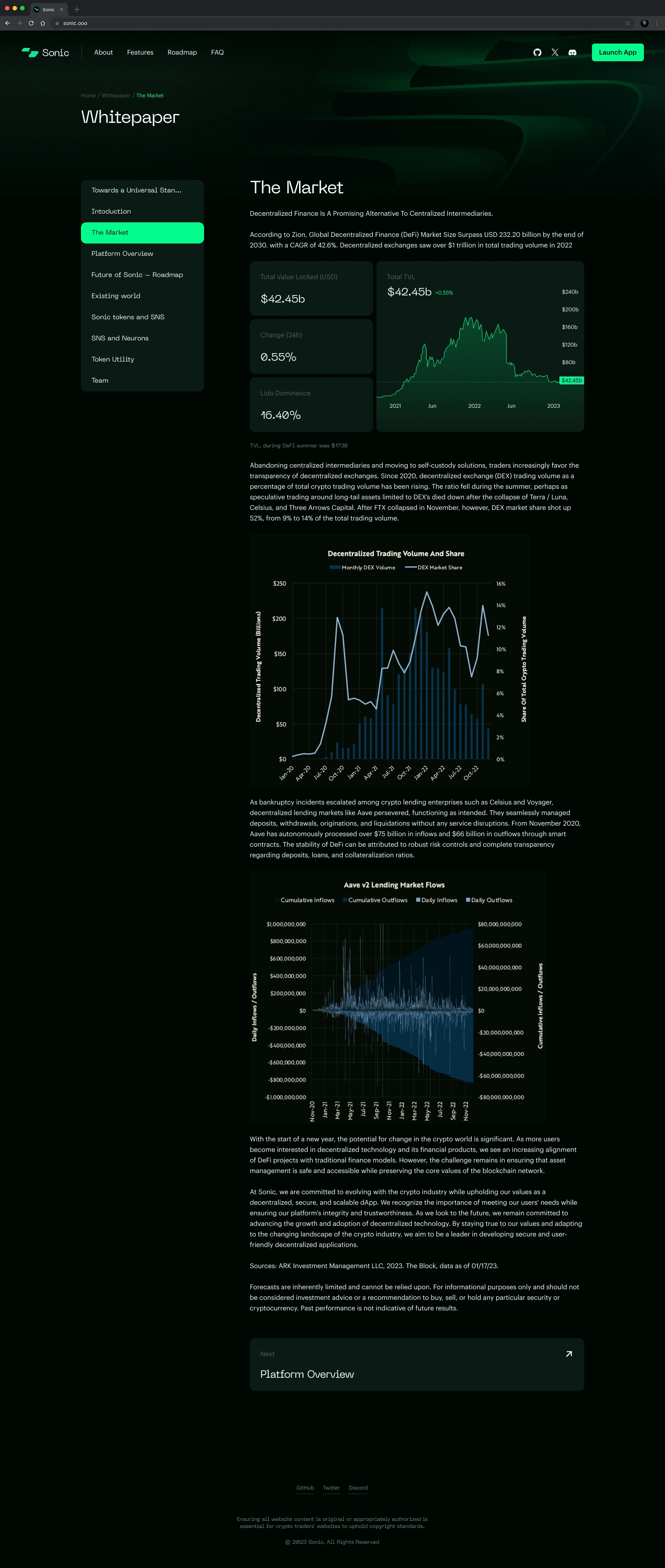
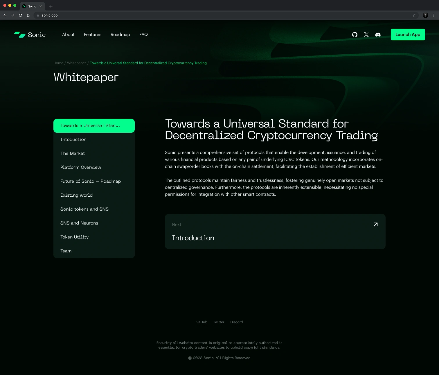
The system, explained.
The whitepaper covers the platform, market, current model, roadmap and proposed trading standard.

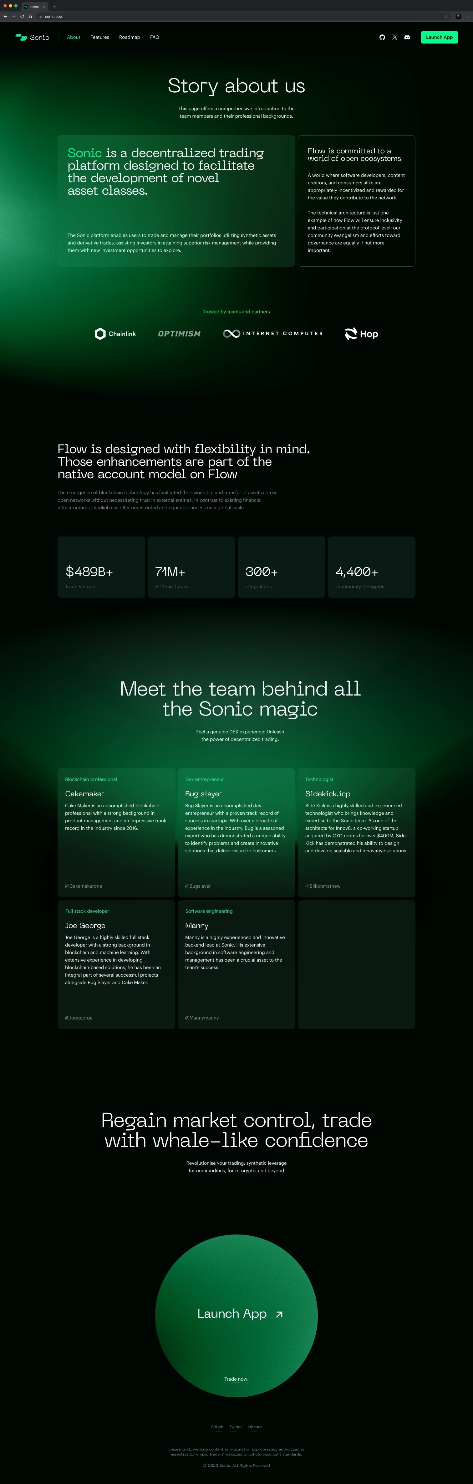
About.
The about page tells the Sonic story and introduces its partners.

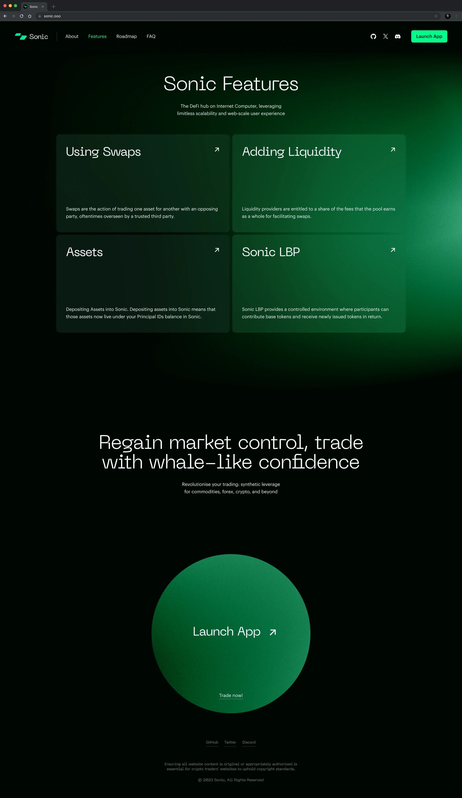
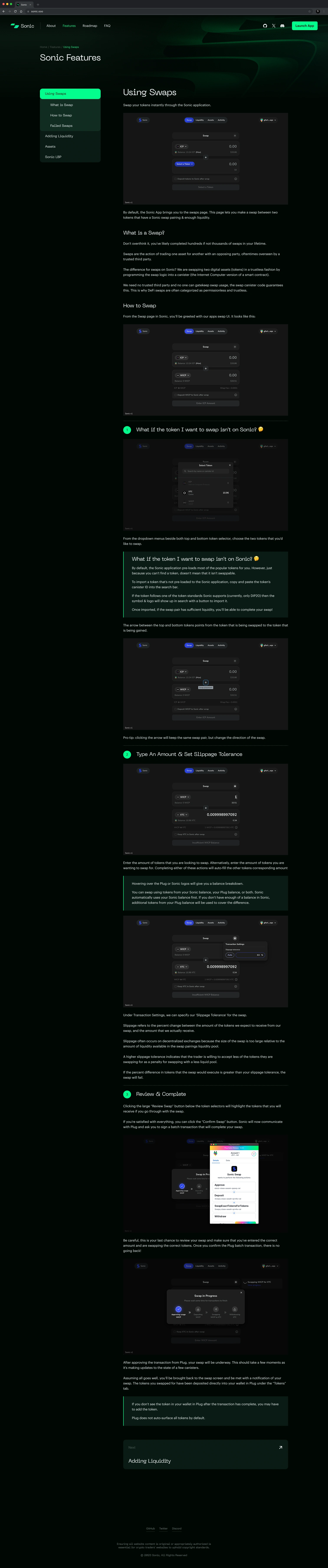
Features.
Each feature, from swaps to liquidity, gets its own explainer.


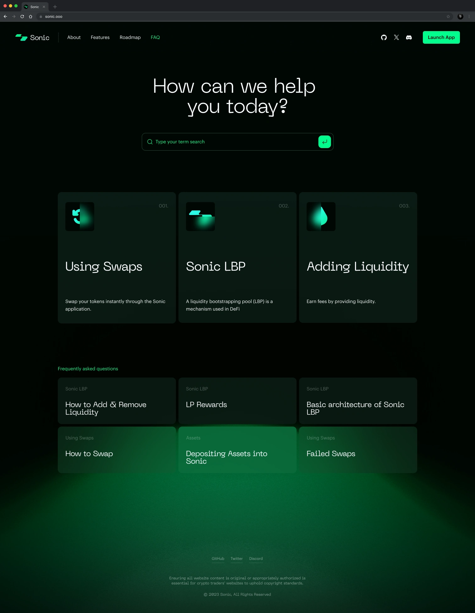
FAQ.
Help topics with a search field at the top.
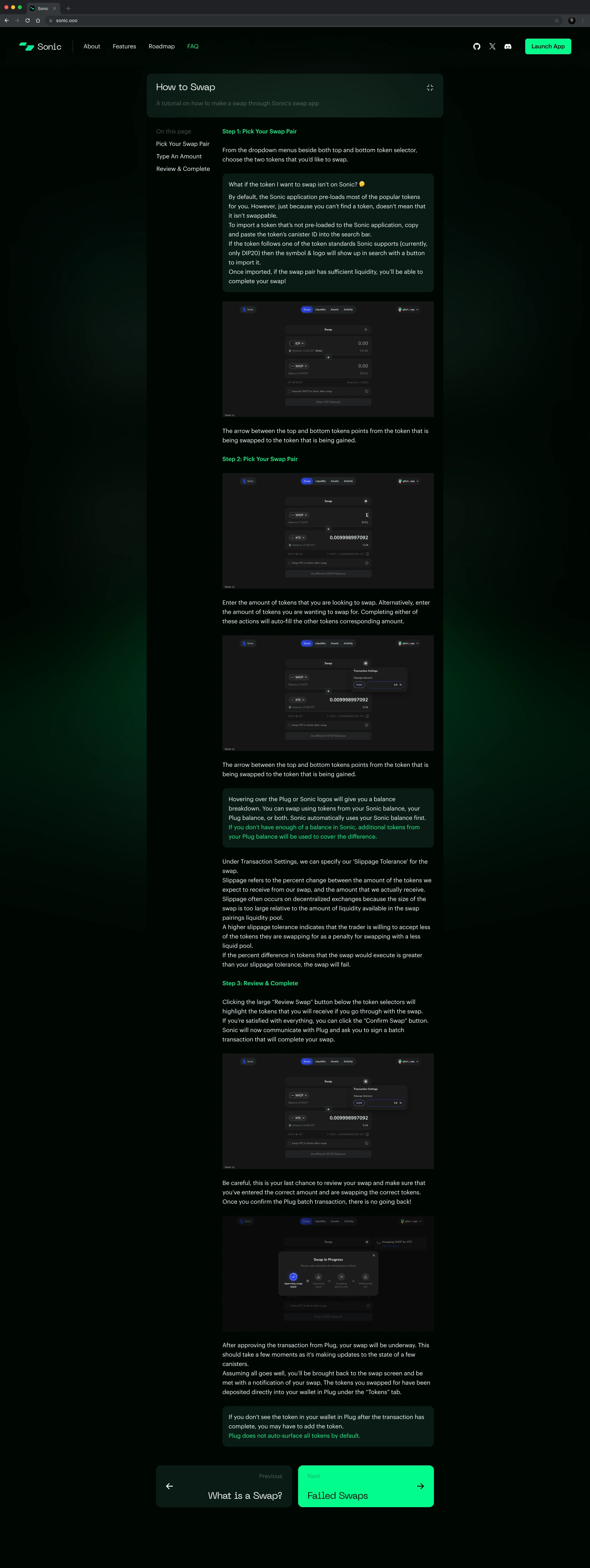


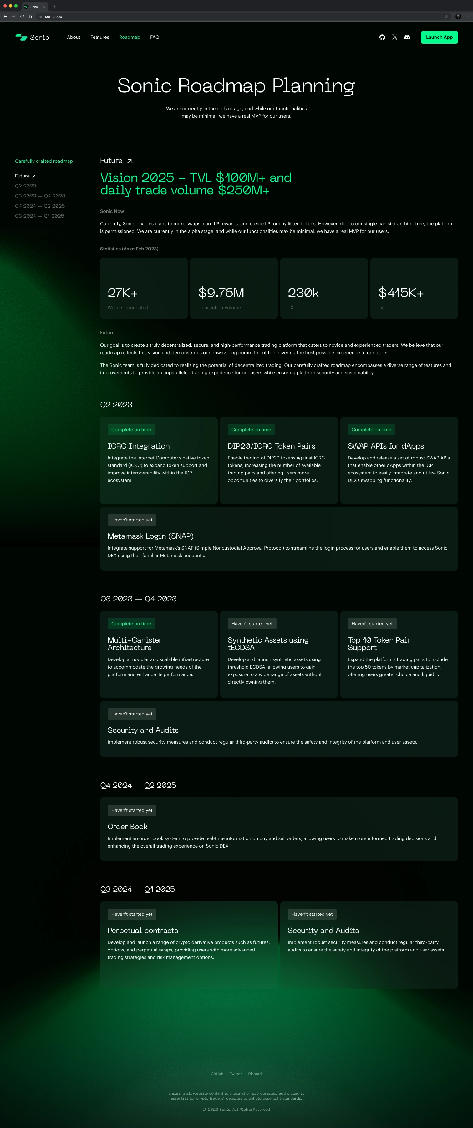
Roadmap.
The roadmap sets out where the platform is heading.

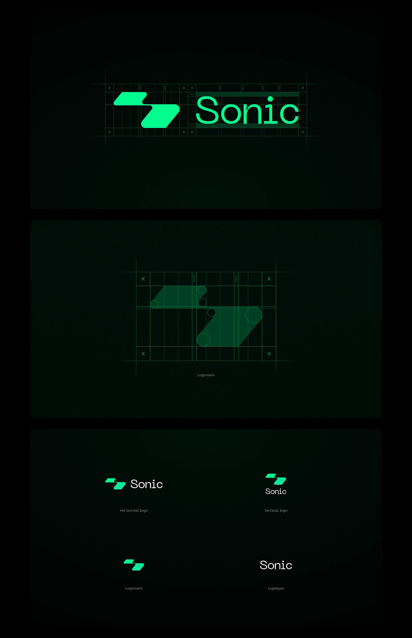
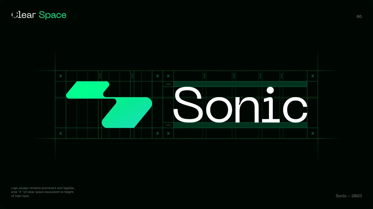
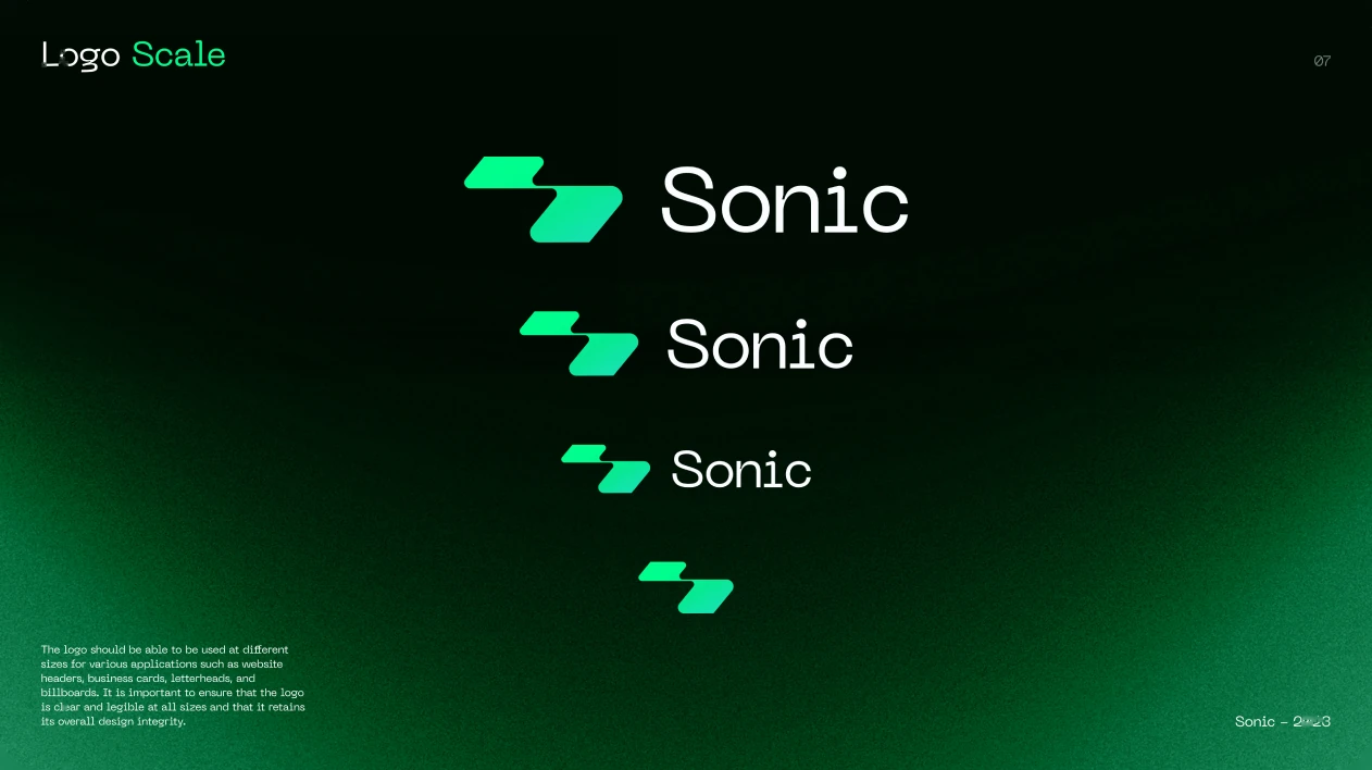
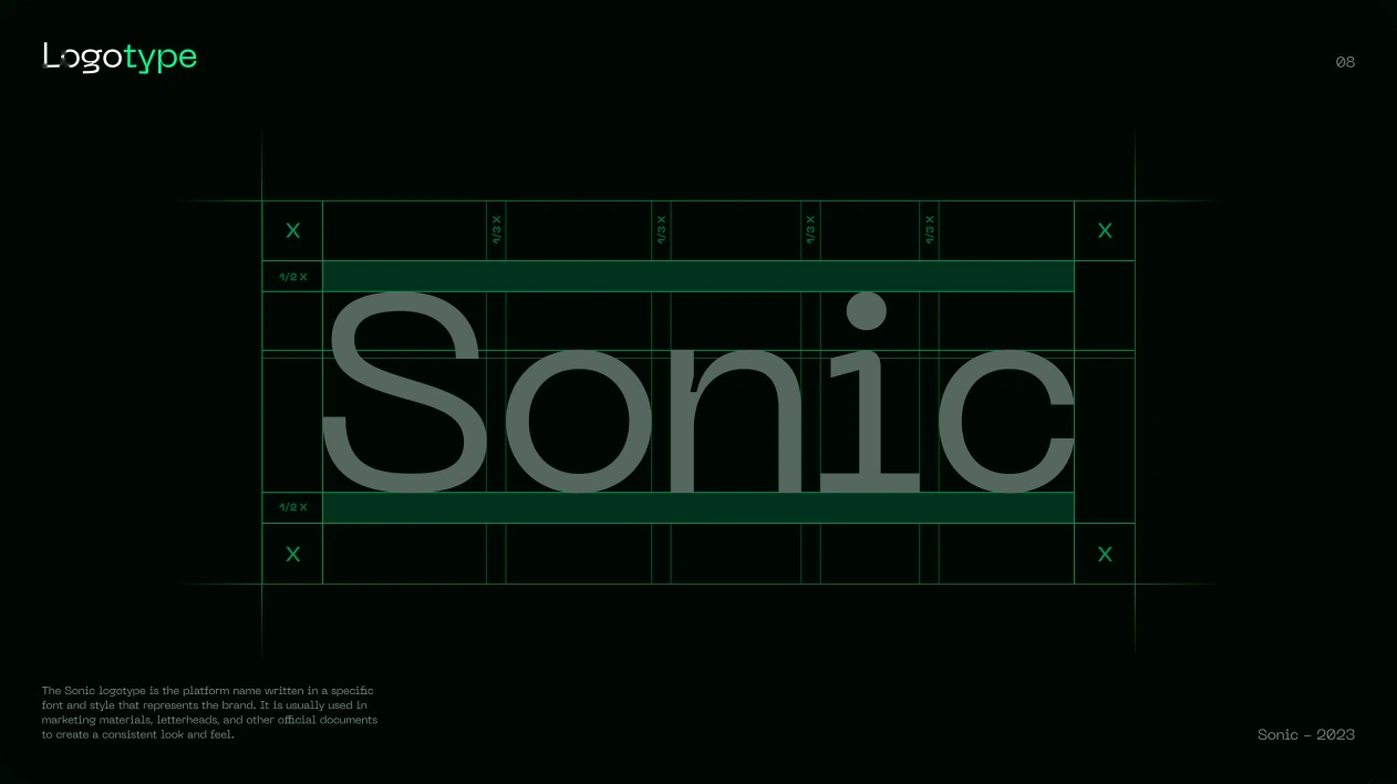
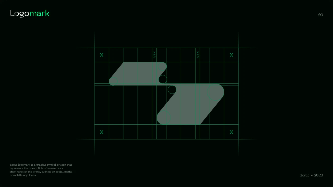
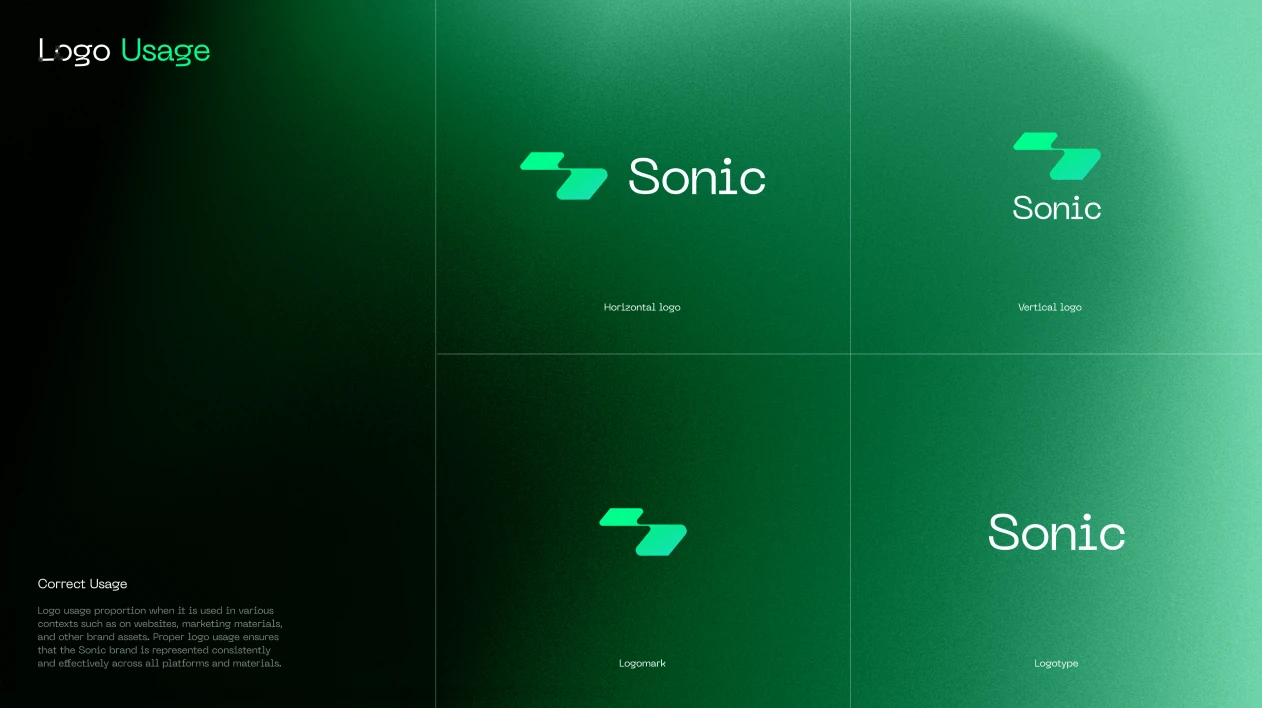
Logo geometry.
The logo is drawn on a strict geometric grid.
Colour and typography.
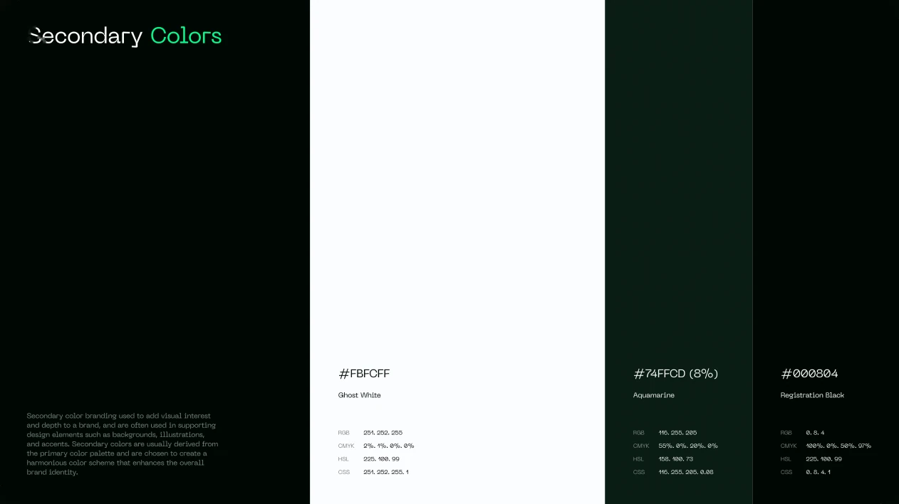
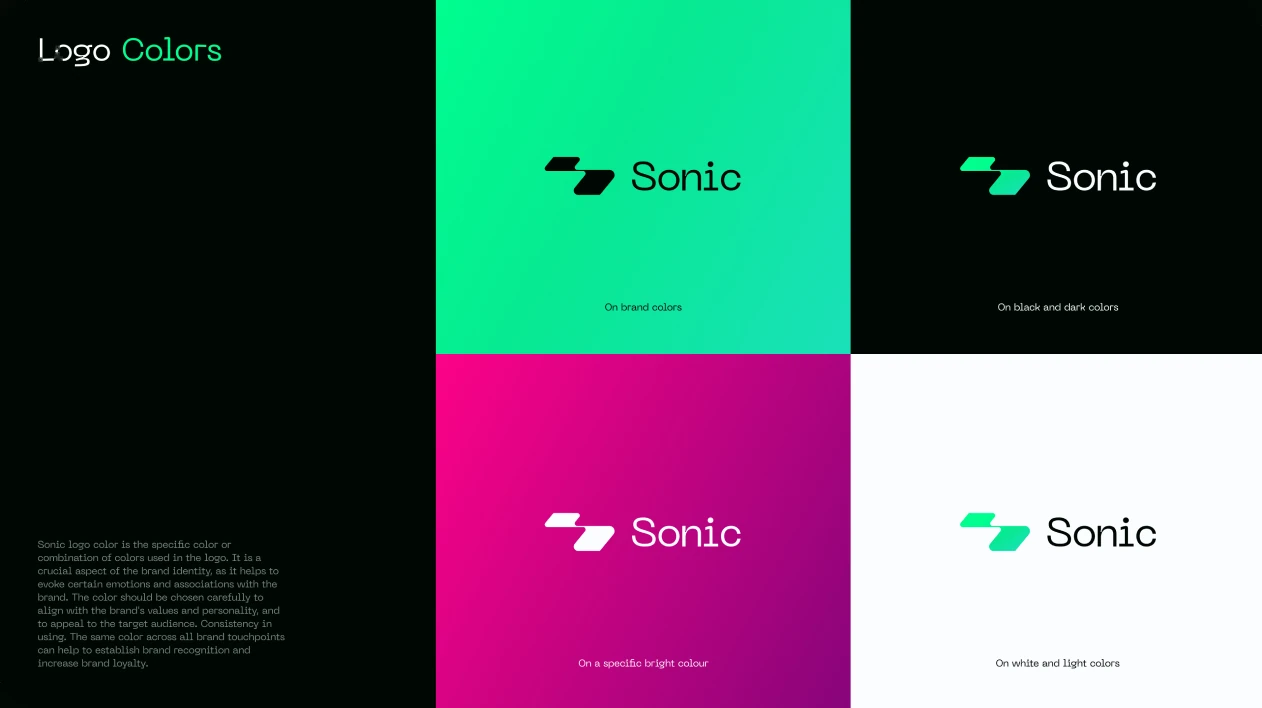
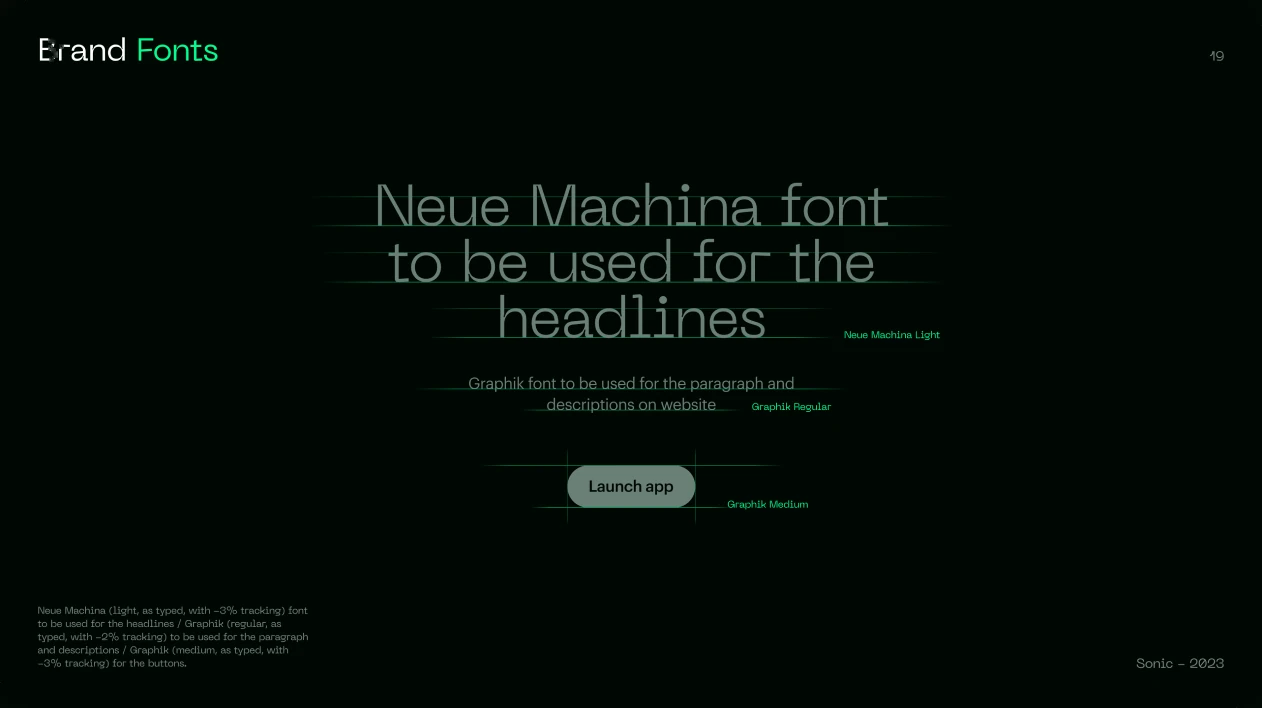
Secondary colours, logo colour variants and the headline typeface.
Across channels.
The identity in advertising, on the website and in social media.